FRESH FACE OF YOUR BUSINESS
Brand Identity Of Your Business
“It’s amazing, but I used to sell only 20-30 pieces per weekend, and after you fixed the brandbook, we’re selling 200!”
Any new business starts… not from a logo. But with answering the questions – what are we selling and who is the buyer of our product. A corporate identity is developed for a specific target group. Before you go to market, someone has to make sure that your product is recognisable and attractive, The buyer must unmistakably associate your product with you.
A customer’s trust is built on their first impression of a company. Just as you form your impression of the person who walks into a room, your customer makes an impression of you within the first few seconds when they receive an email, business card or visit your website.
Try not to miss this brief moment.
Many people think that creating a logo is enough and it’s a done deal. But a company’s image is more than that.
You will need to build a style of communication with the customer, a uniform style of mail messages, a common appearance of your products. Even the design of the shop window should not be out of the general style.
To ensure that all employees (including the owner) are aware of the general behaviour of the company, a common standard called a brandbook is drawn up.
A brandbook is necessary to maintain a unified image of your brand, regardless of who is working on it. It will make it easier to delegate tasks to designers, marketers and copywriters, to be sure that the logo in advertising is the right colour and blog articles are written in your style.
By following brand guidelines, you’ll soon realise how much easier they make the job of bringing new products and services to market.
But it was one of our old clients who best revealed the meaning of the brandbook: “It’s amazing, but I used to sell only 20-30 pieces per weekend, and after you fixed the brandbook, we’re selling 200!”
Explore our collection of brandbooks from famous companies such as Coca-Cola, Dove, Johnnie Walker, Pepsi, Audi, Mercedes-Benz and other famous trademark owners. We will be guided by the latest design trends when developing your style.
DEFINITIONS
What Is The Difference Between A Brandbook And A Corporate Identity?
Corporate identity is the graphic techniques that make a brand meaningful and attractive in the eyes of the public. Graphics forms the image of the company, which is called in different ways: identity, corporate identity, corporate style, corporate identity and others. These are synonym words that describe the visual image of a company or brand.
What is the difference between a brandbook and a guideline? First of all, in the content: a brandbook contains a full description of the brand, while a guideline contains only its visual identity.
However, despite the differences between a brandbook and a guideline, they have some common features. Firstly, both documents allow structuring and unifying everything related to the brand, developing uniform rules for all employees and contractors of the company. Secondly, both documents work towards a common goal: to create a single, coherent, recognisable image of a strong brand, which ultimately leads to an expanded target audience and increased sales.
We have prepared for you a selection of several examples of what brandbooks of well-known companies look like in terms of their corporate identity.

YOUR SOLUTION
What Is Needed In Your Case?
A Logo, a Guideline or Full Brandbook?
No one wants to pay too much, especially at the very beginning of a business. So let's find out in which cases a single logo will be enough, and when it's worth developing your own guideline from the very beginning, or even a brand book.
When it's Necessary
Franchise Or Outsourcing
If you are opening shops or offices overseas or selling a franchise - a brandbook is essential to ensure the brand image is the same in all countries.
Or if you have marketers and designers who work out of state.
Or if you have marketers and designers who work out of state.
Tenders
If you are a large company and hold tenders to create advertising, corporate events and gifts, it is important that the result of the tender task is as close as possible to the one you can use.
Long-term clients
If you are a company that markets your own products or services and you care about the recognisability of your brand. When applying to different contractors to print package or design an interior, you should demand that they all follow the same rules.
Growing company
If the number of employees grows with your business and you need to communicate your corporate identity to everyone. A brandbook can help executives save time and make it easier for a newcomer to dive into company specifics.
When There Is Another Solution
New or start-up company
Such company has not yet formed a style, so there is no need to prescribe a lot of details. In this case, it is enough to create a bright logo and select common corporate colours that will be used in the design of products or room design.
Small business
When design and texts are handled by one person in the company. He will, of course, be able to memorize the style of his proposal himself. But as soon as the company starts to grow, new employees will need a concise compilation of brand rules - a guideline.
New Trade Mark Registration
When you have to prevent anyone else from using your trade mark or logo, it needs to be registered. When developing such an image, a designer works with a lawyer - they cannot make a mistake and repeat an existing registered mark.
Buying a Franchise
In this case, you really don't need anything - the franchisor will provide everything. They will even help you to find a business premises. But the financial risks will still be on your side, so you will have to worry about promoting your point of sale.
PRICE LIST
Development Of Corporate Identity
Without wasting any time, you can order your package directly from our website.
Please note that the cost may vary depending on the scope of work.
Please note that the cost may vary depending on the scope of work.
€149
STARTER PACKAGE
Logo Development
- Defining the client's objectives
- Determination of colour scheme
- Logo development
- 3-4 variants
- Usage demonstration
- Any vector formats
€699
OPTIMAL PACKAGE
The Brand Guideline
- Brand visual identity description
- Part of the brandbook describing only the visual image
- Open document for employees, executives, journalists
- Necessary tool for designers, outsourcers, printers
€1.299
FULL PACKAGE
Brand Development
- Complete brand development
- A large-scale document describing all levels of the brand
- An internal document containing corporate identity
- For managers and marketers of the company and its divisions
FAMOUS EXAMPLES
What A Brandbook Looks Like
We have prepared for you a selection of several examples of what brandbooks of famous companies look like in terms of their corporate style.
Audi Online Brandbook
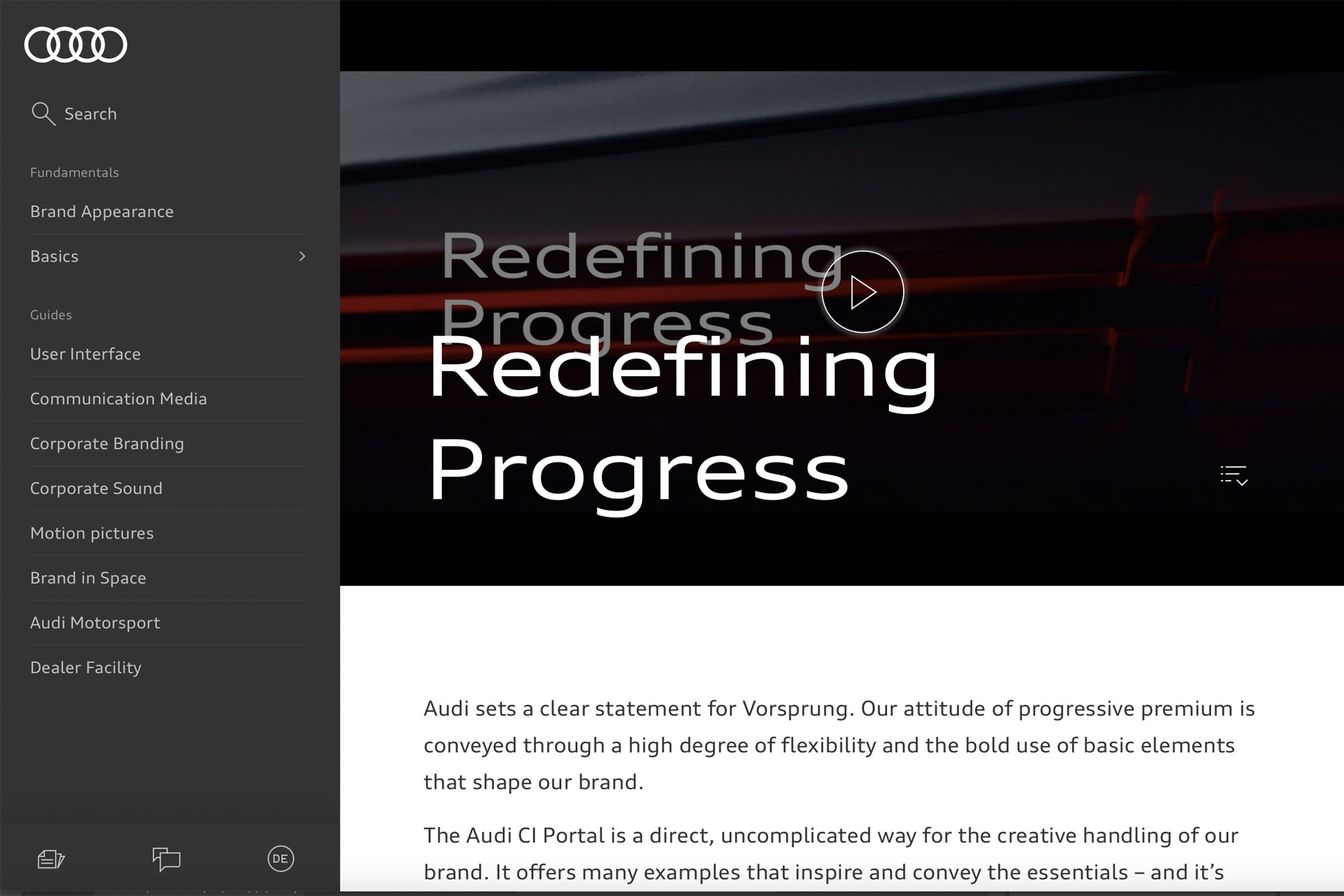
Audi brandbook – the most modern way to develop a brandbook online. It is easier to design it as a landing page. It explains the brand guidelines interactively. From here you can also download the information you need for your partners.
Before such a page can be developed, a developed corporate identity is required. Audi sets a clear statement of Vorsprung. Our attitude towards progressive premiumisation is conveyed through a high degree of flexibility and the bold use of the basic elements that form our brand.
The Audi CI portal is a direct and easy way to creatively address this brand. It offers a wealth of examples that inspire and convey the essentials, and is structured so that you can get started straight away. A living style guide that is constantly expanding across all touchpoints.
Coca-Cola Brandbook
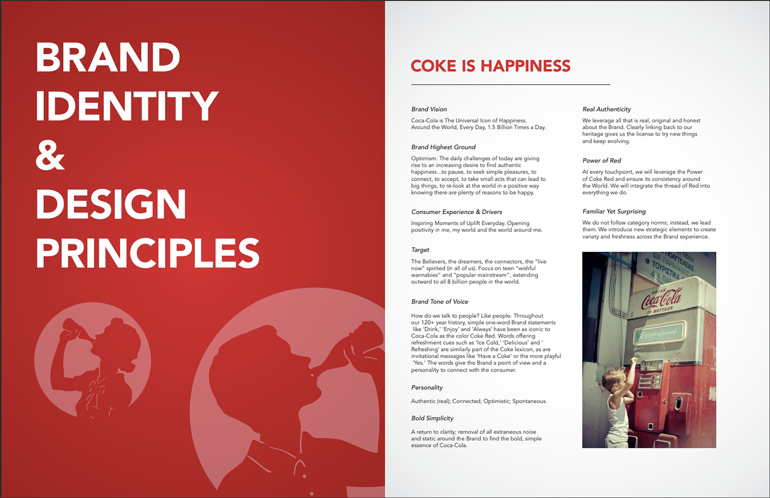
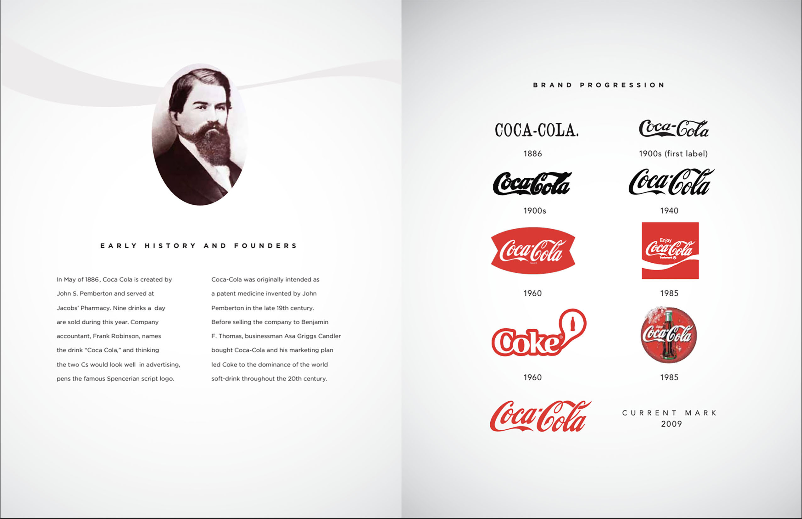
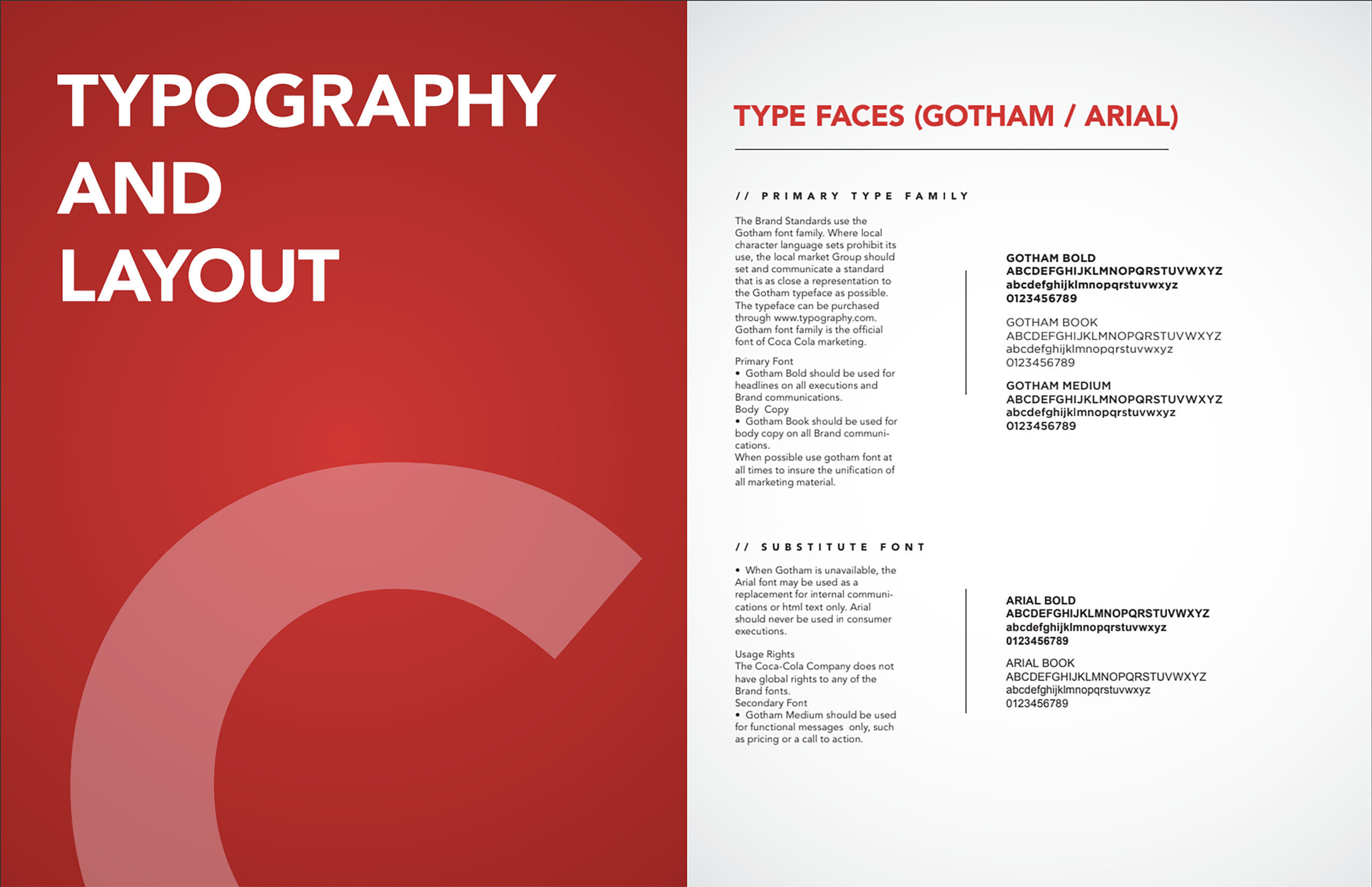
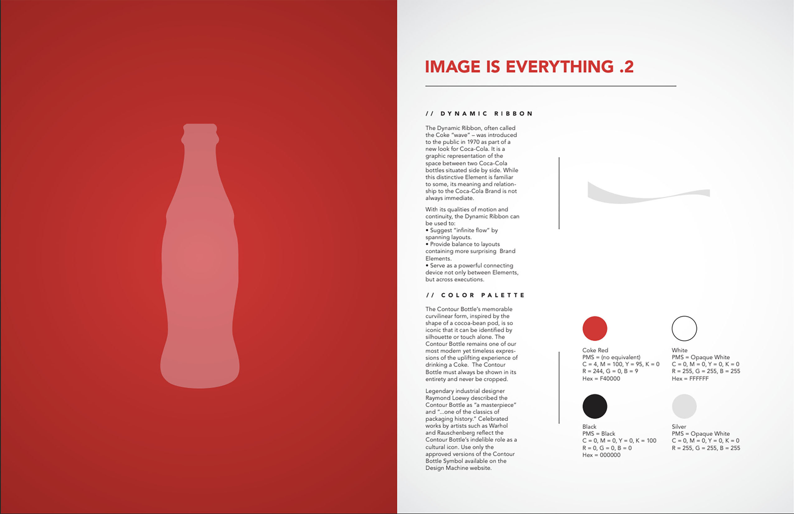
The book outlines a brief history of the brand, key brand values and standards. It then focuses on the brand identity and the basic principles of how a graphic designer uses the style.
Coca-Cola’s core brand message is enjoy life and be happy. Join to be happy like us. The centrepiece of the brand book is, of course, the drink itself.
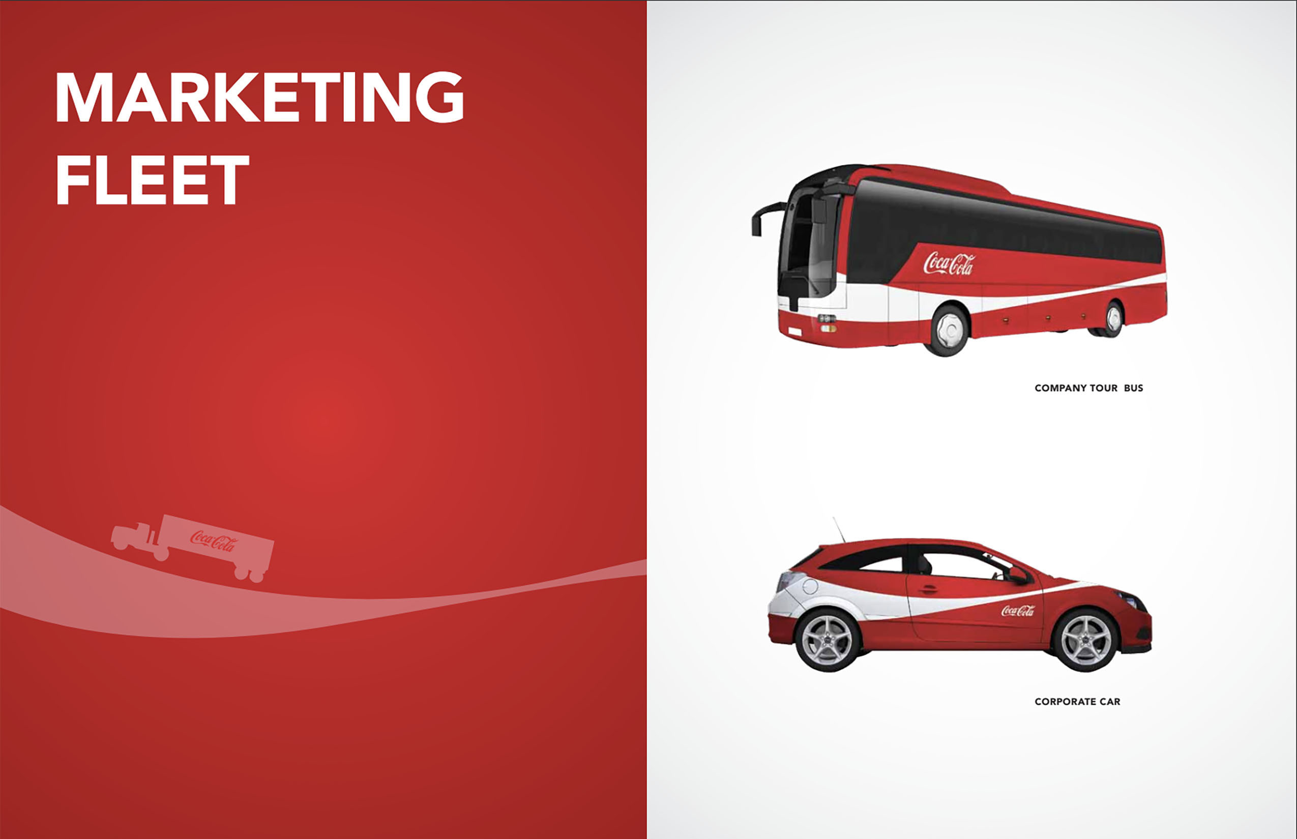
The key elements of the brand are the Spencer font on which the logo is based, the contoured bottle, the dynamic ribbon and the signature colours in the Pantone scale. The globally recognisable brand assets form a visual core that is consistently present on packaging, advertising and communications. In 1969, the Coca-Cola trademark was complemented by a white wave. But in 2017, after rebranding, it disappeared.
Some details indicate that this is not the original brandbook. Most likely, it was created by fans of the brand or one of the regional dealers. But it is made very decently.
Dove Brandbook
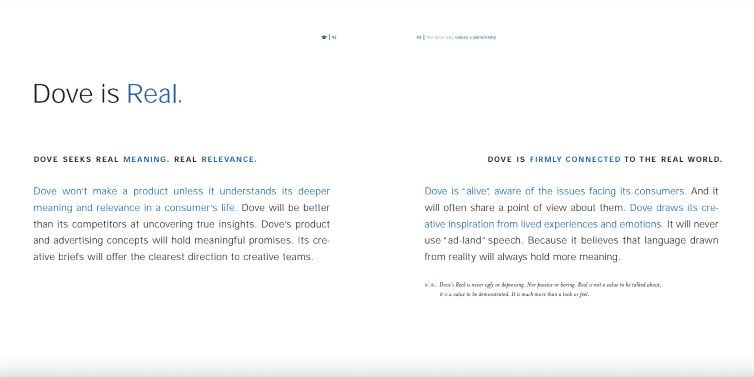
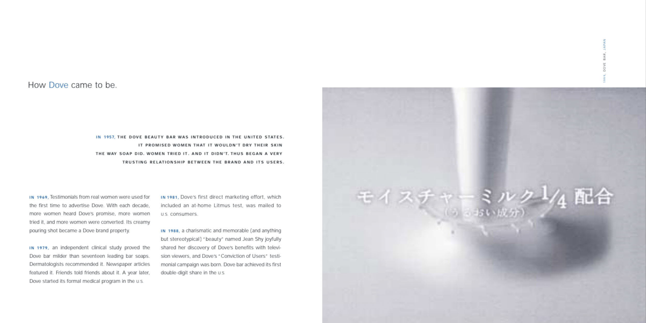
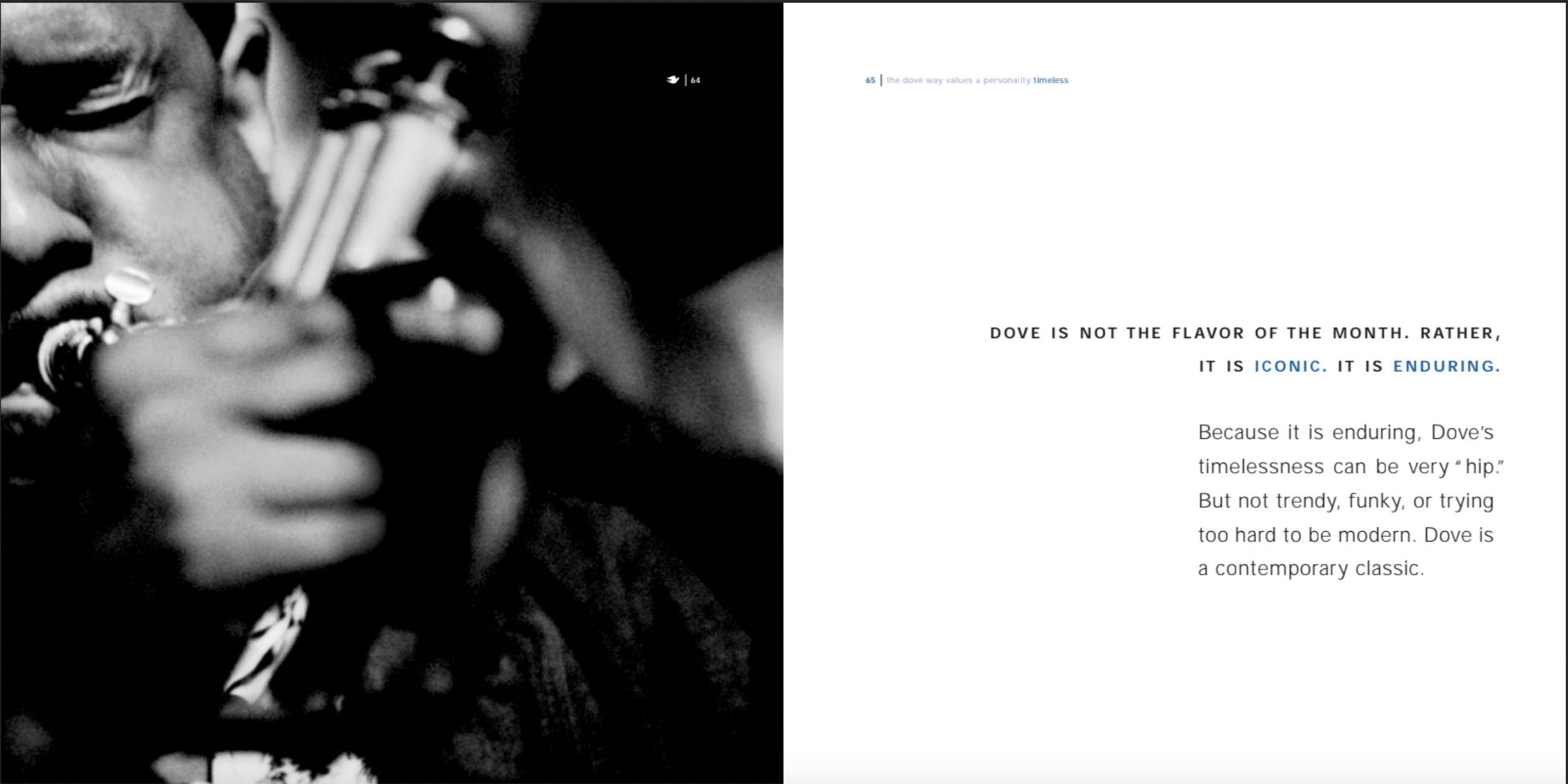
In line with the Real Beauty Promise, the Dove brand is committed to showcasing only real women, not digitally altering their appearance and helping the next generation develop a positive relationship with beauty.
The Dove brand book defines the core brand characteristics and benefits that differentiate the brand in a competitive environment and help drive the brand. The brand book explains how critical intangible assets help build a strong connection with audiences and win the hearts of women.
Dove’s brand essence is evidenced by the photographic style of the brand book. The document is illustrated with “real” women, devoid of digital retouching. The brand argues that consumers increasingly trust the authentic and real, rather than “unadvertised” people, institutions and brands.
Google Trends Brandbook
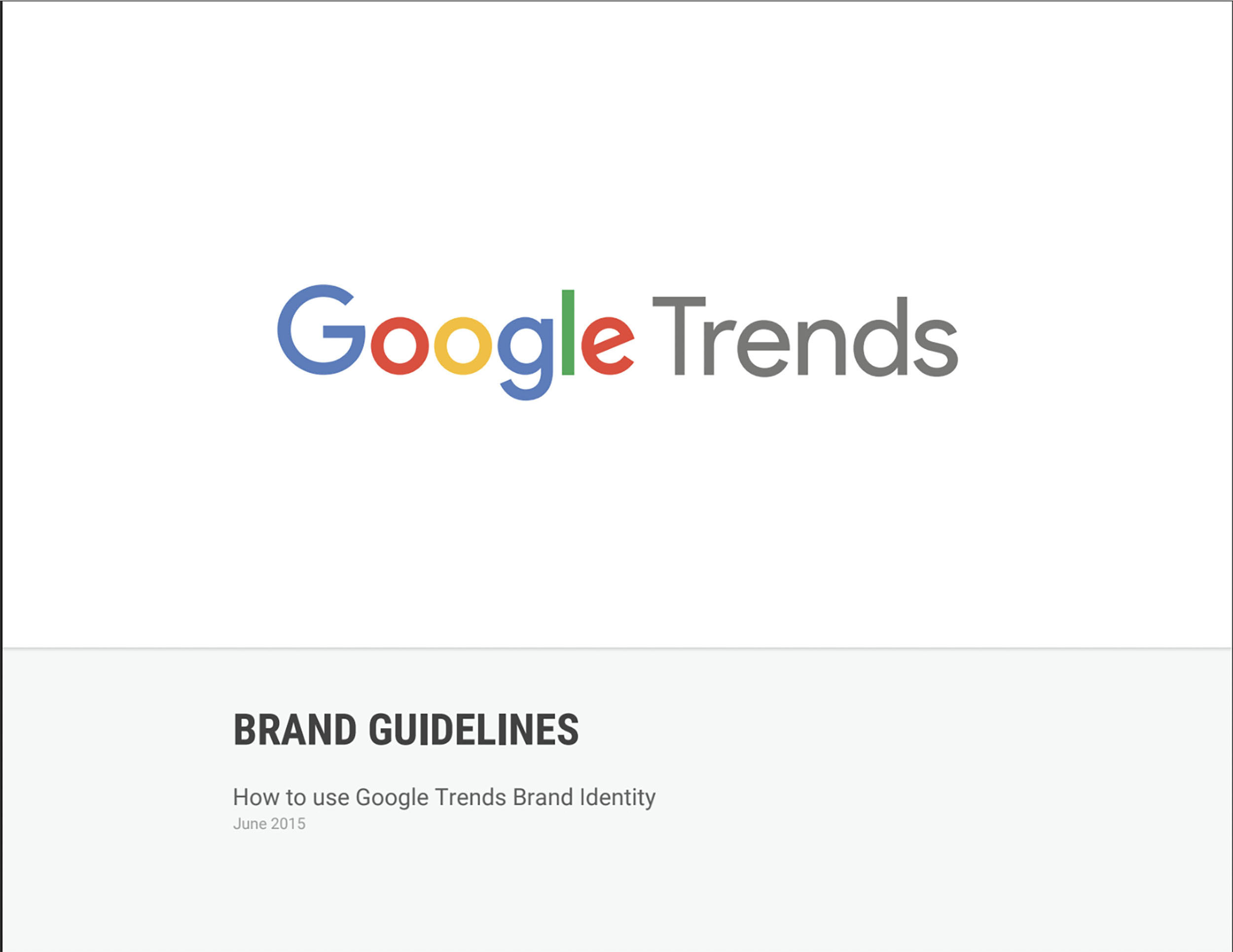
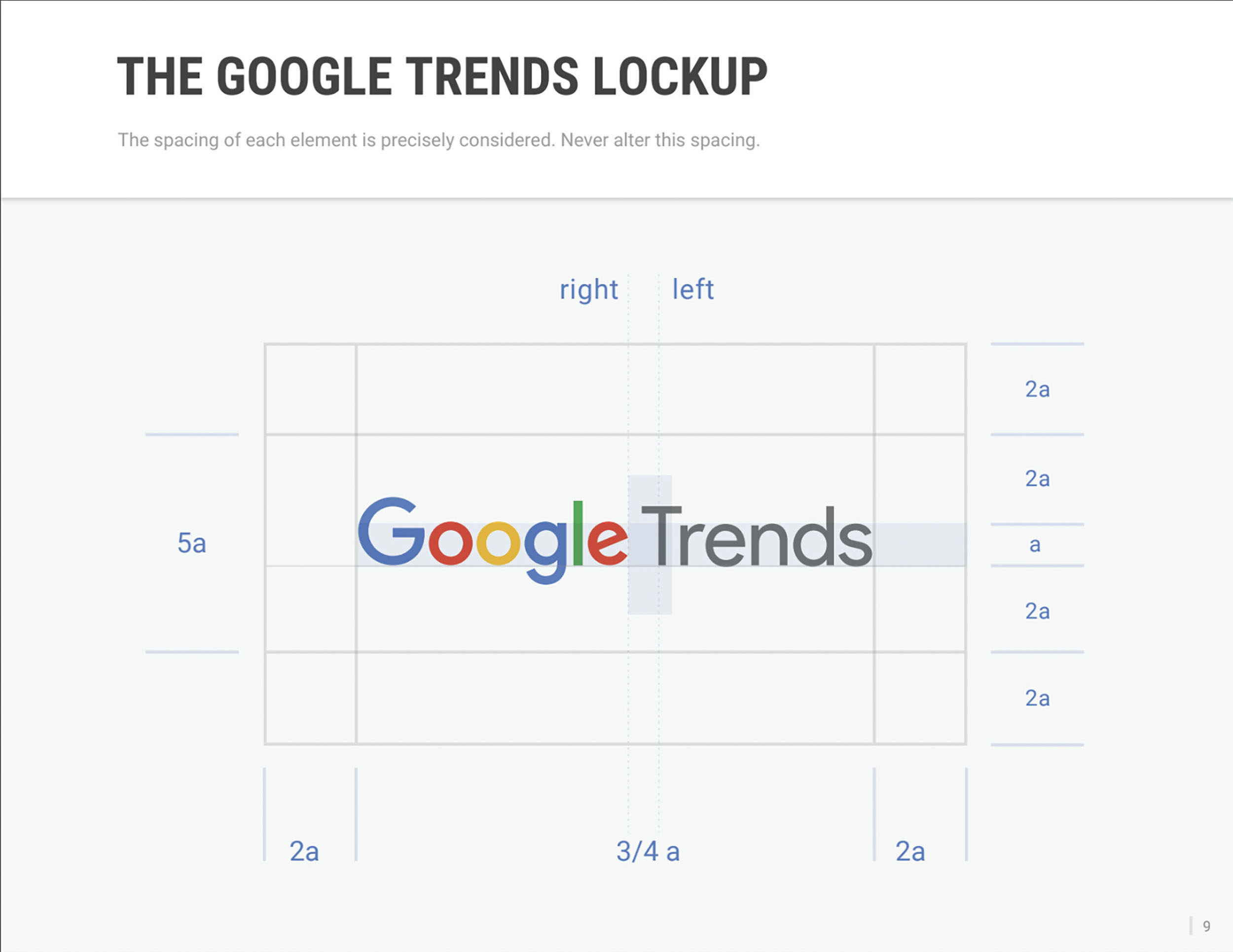
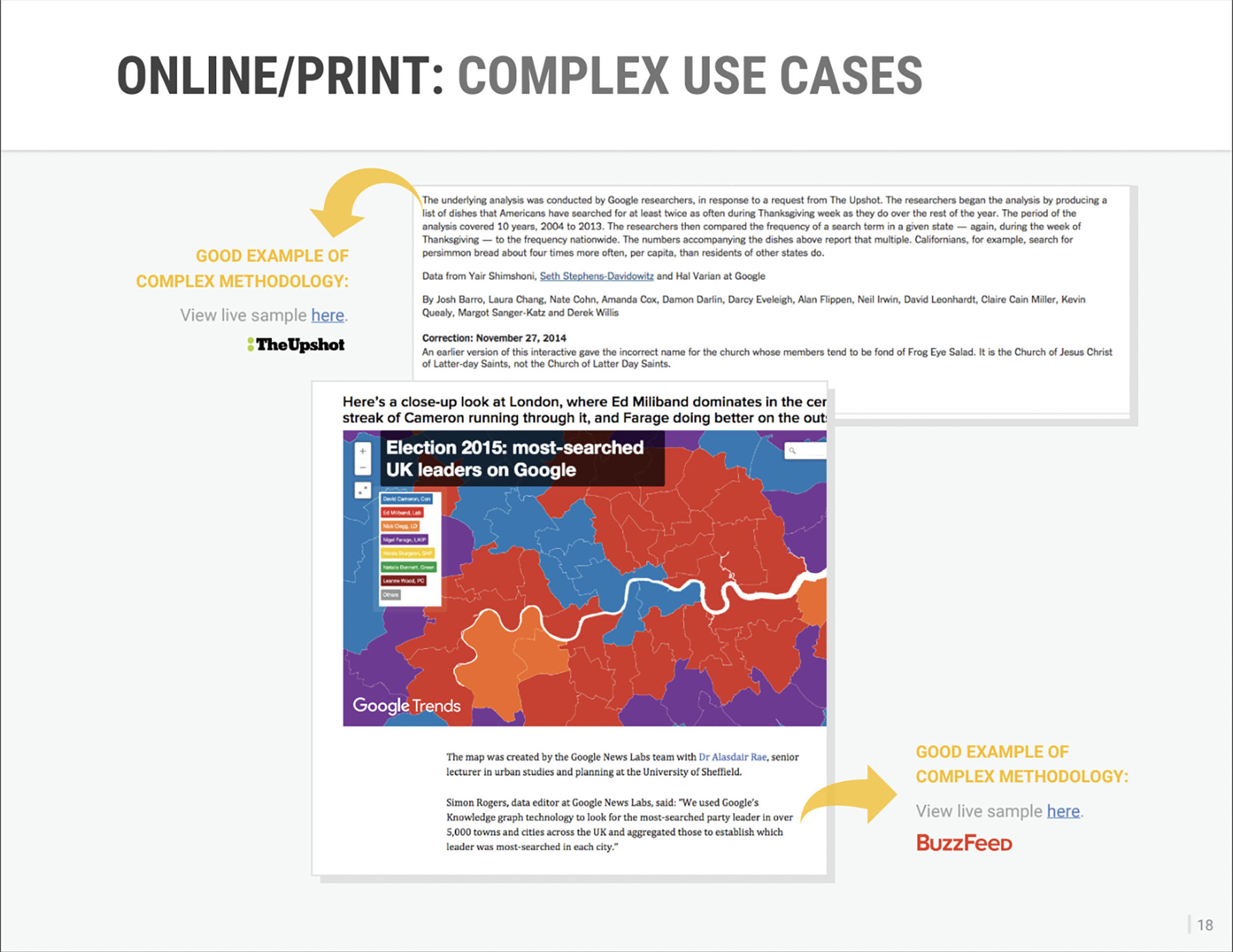
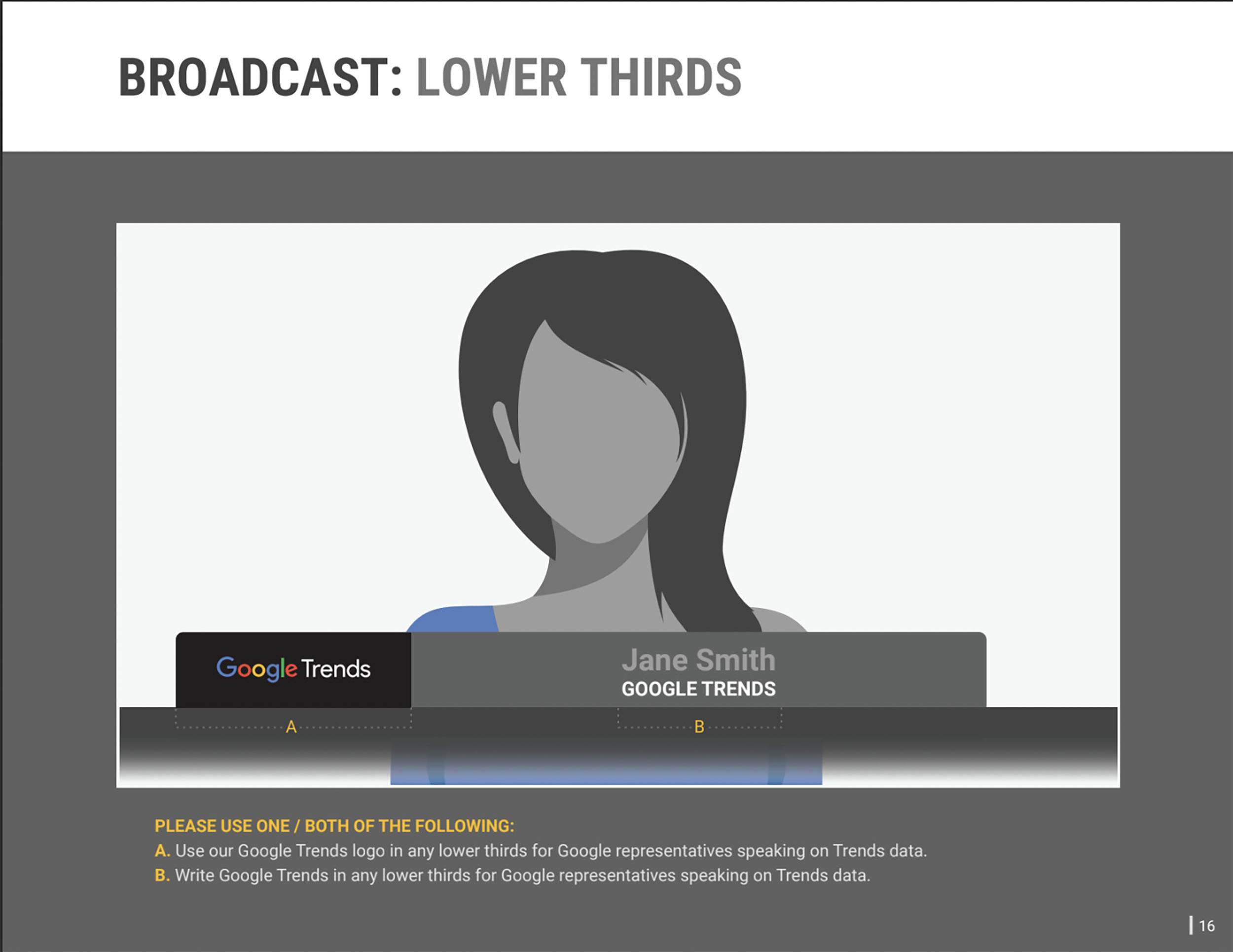
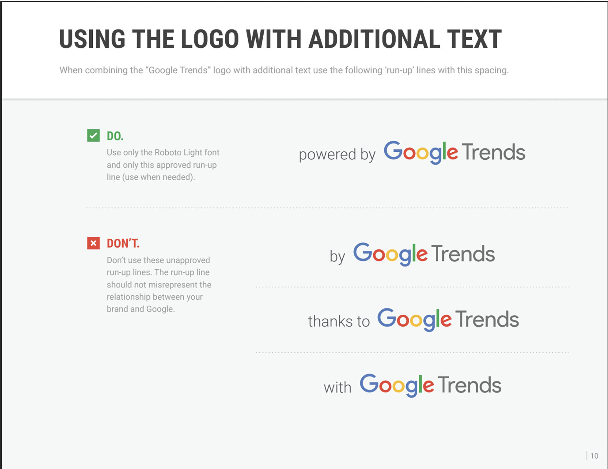
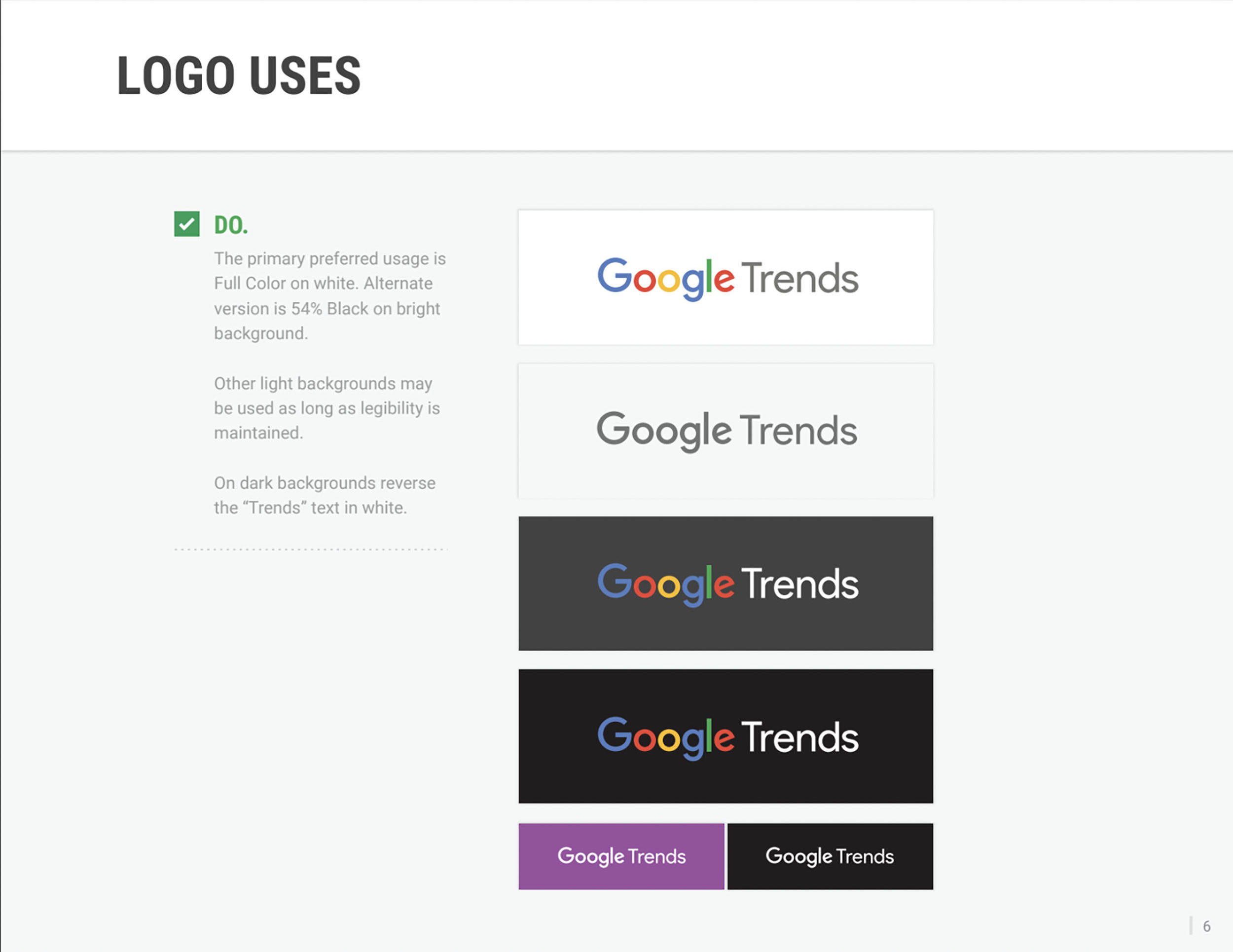
In Google’s new guideline, let’s say “a brand identity guide”, the company outlines how the new logo can be used, using the Google Trends web app as an example.
The corporate identity guide provides guidance on how to use the Trends name, logo, and language in materials without having contractors call the company’s marketing department. The document includes several examples of usage, as well as links to resources that can be downloaded and used.
Jamie Oliver Brandbook
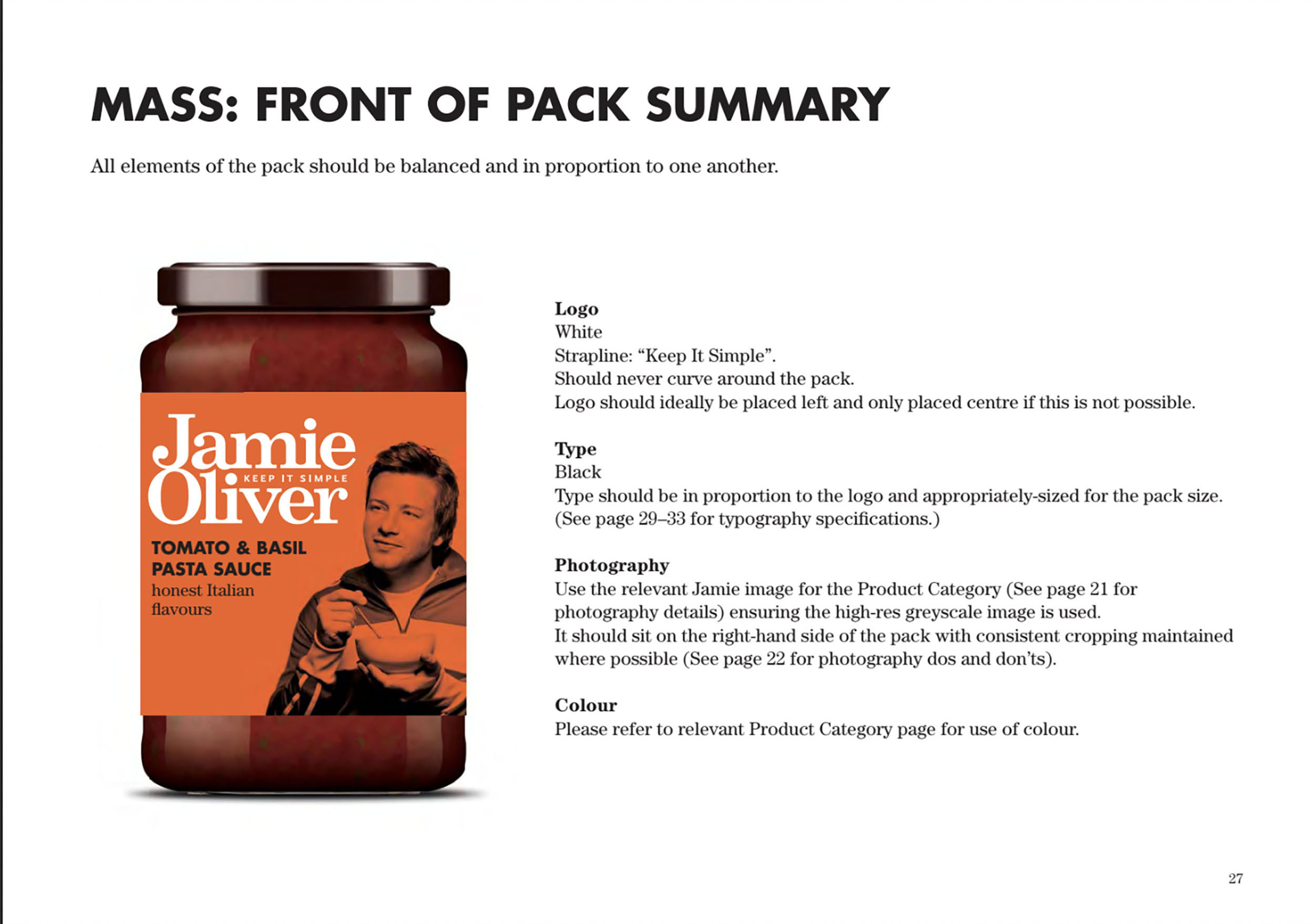
Jamie Oliver is not just a cook. He is a colorful personality who can inspire not only with his recipes, but also with his charisma and wit. He has written several recipe books and is the owner of the Fifteen restaurant chain. He has been cooking since he was eight years old and has won the love of millions of ordinary people who want to learn how to cook.
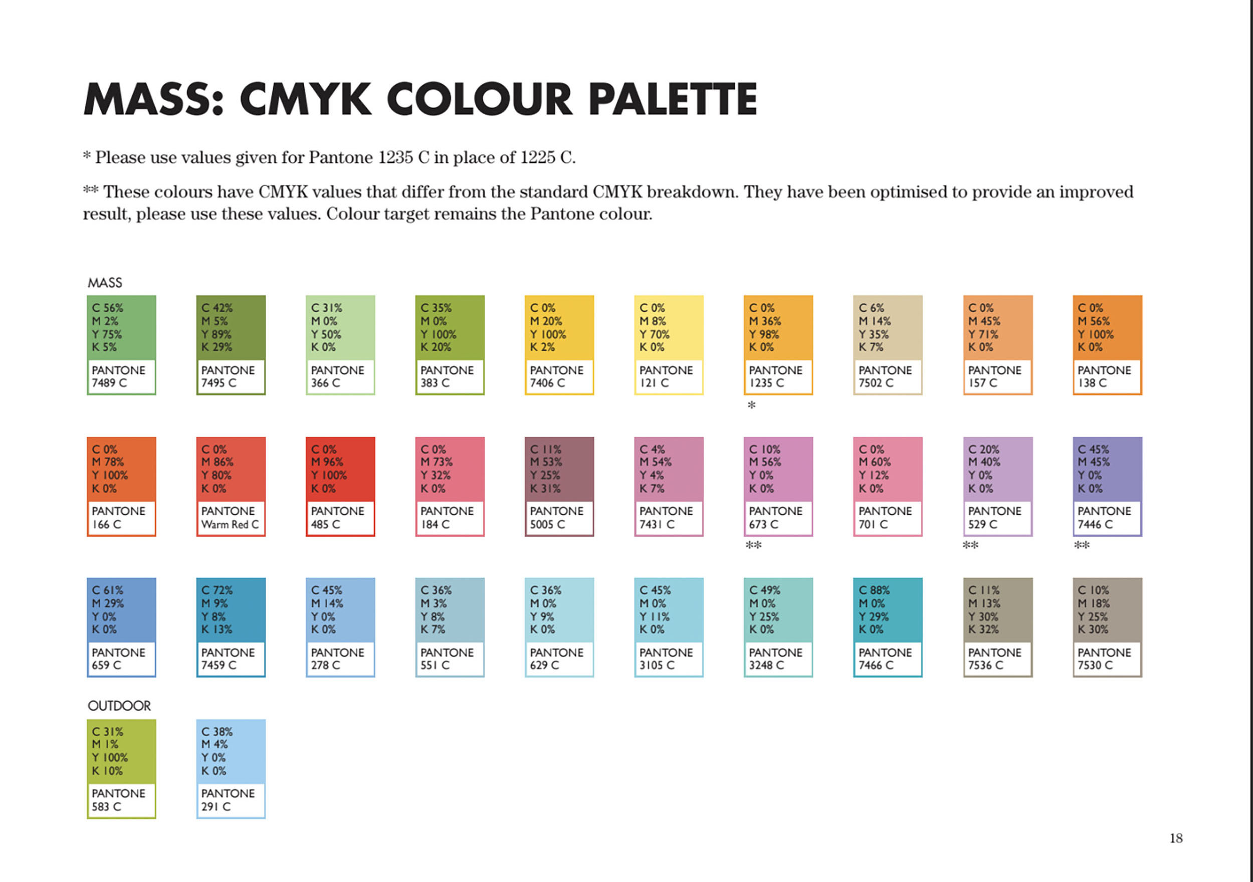
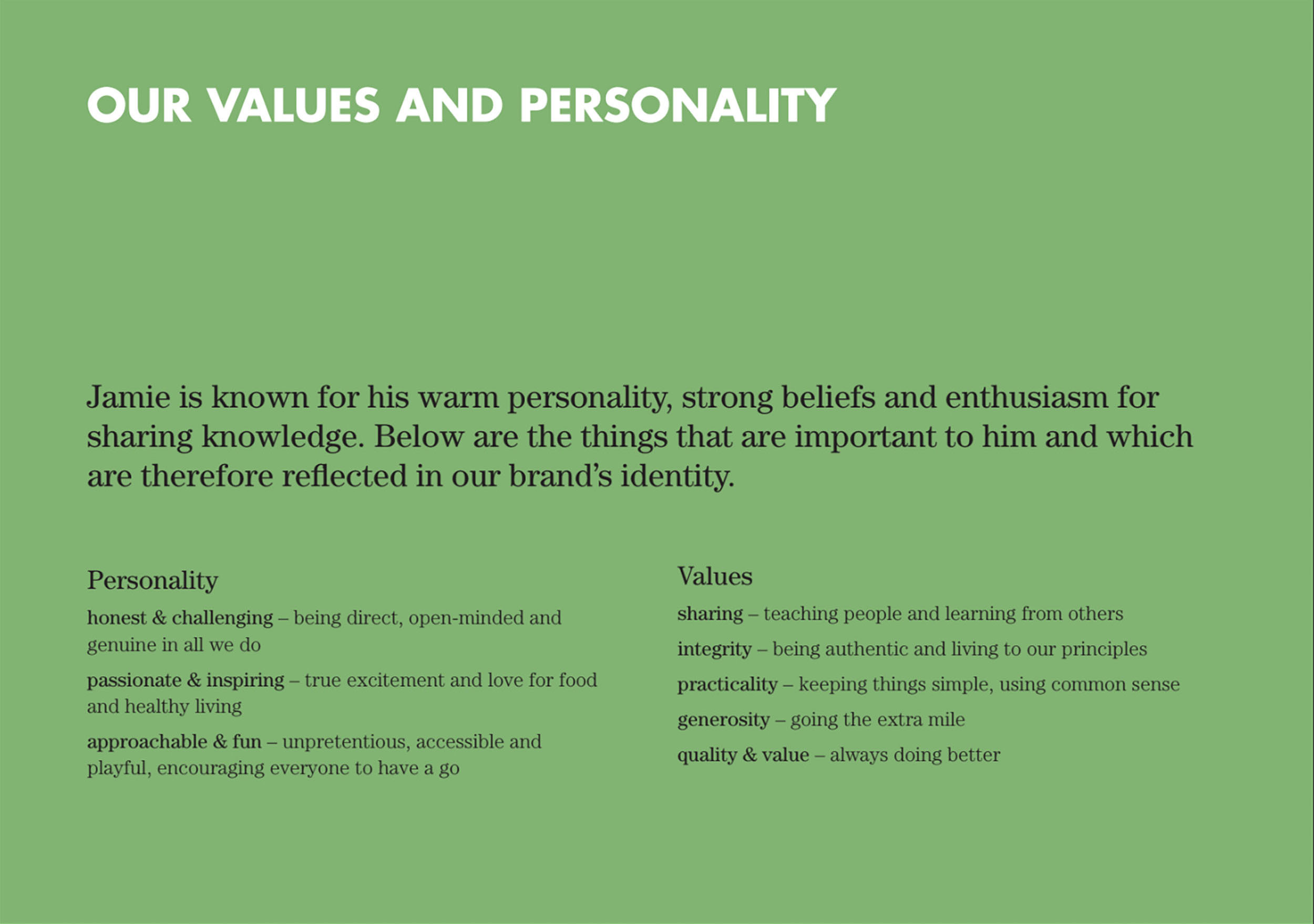
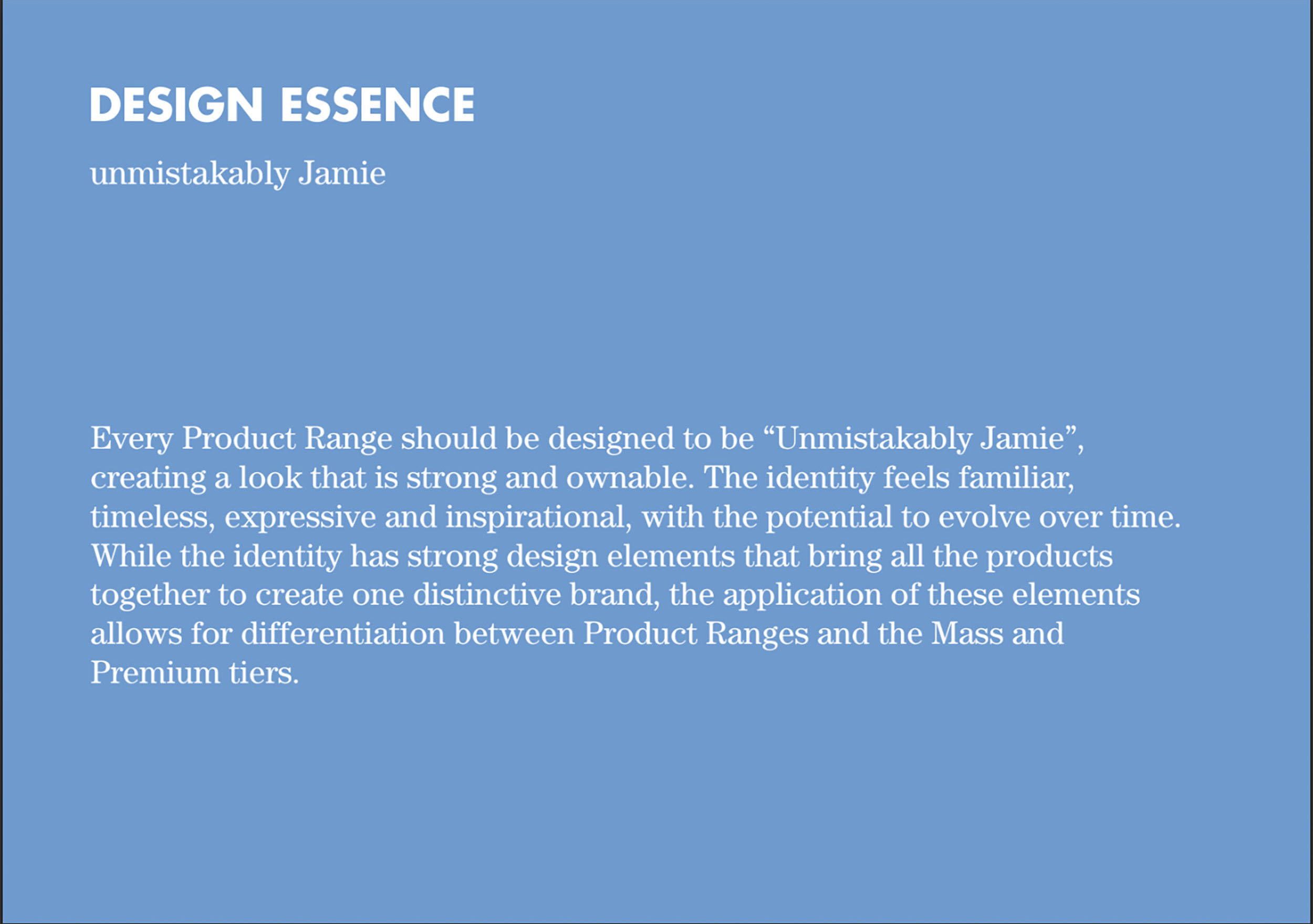
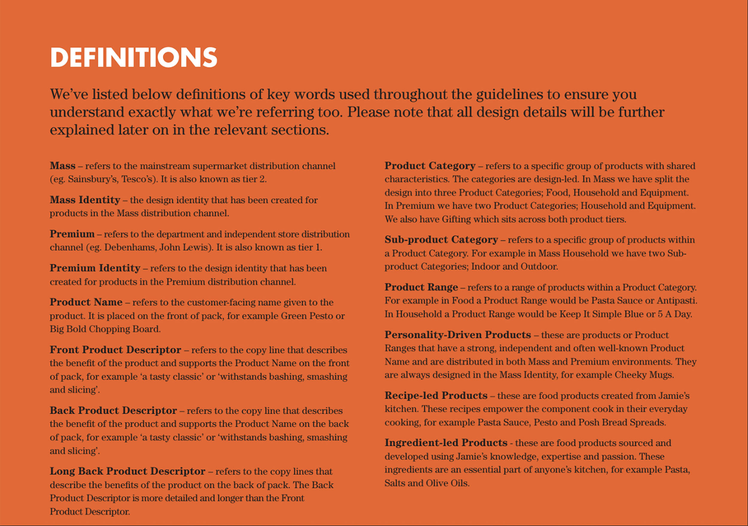
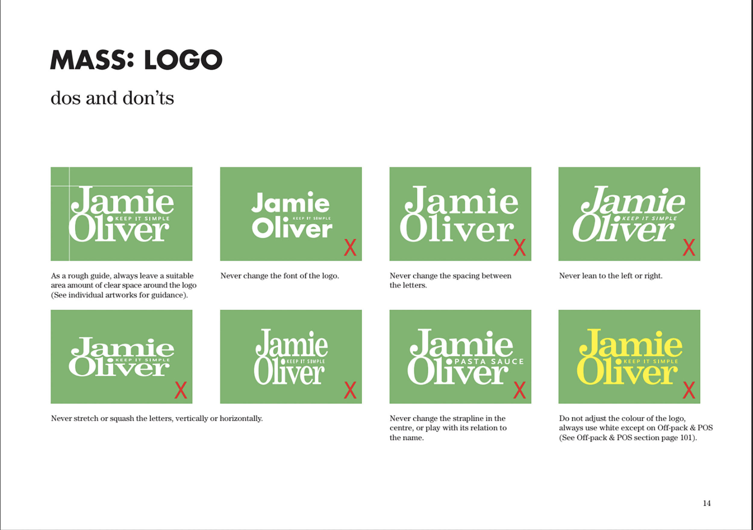
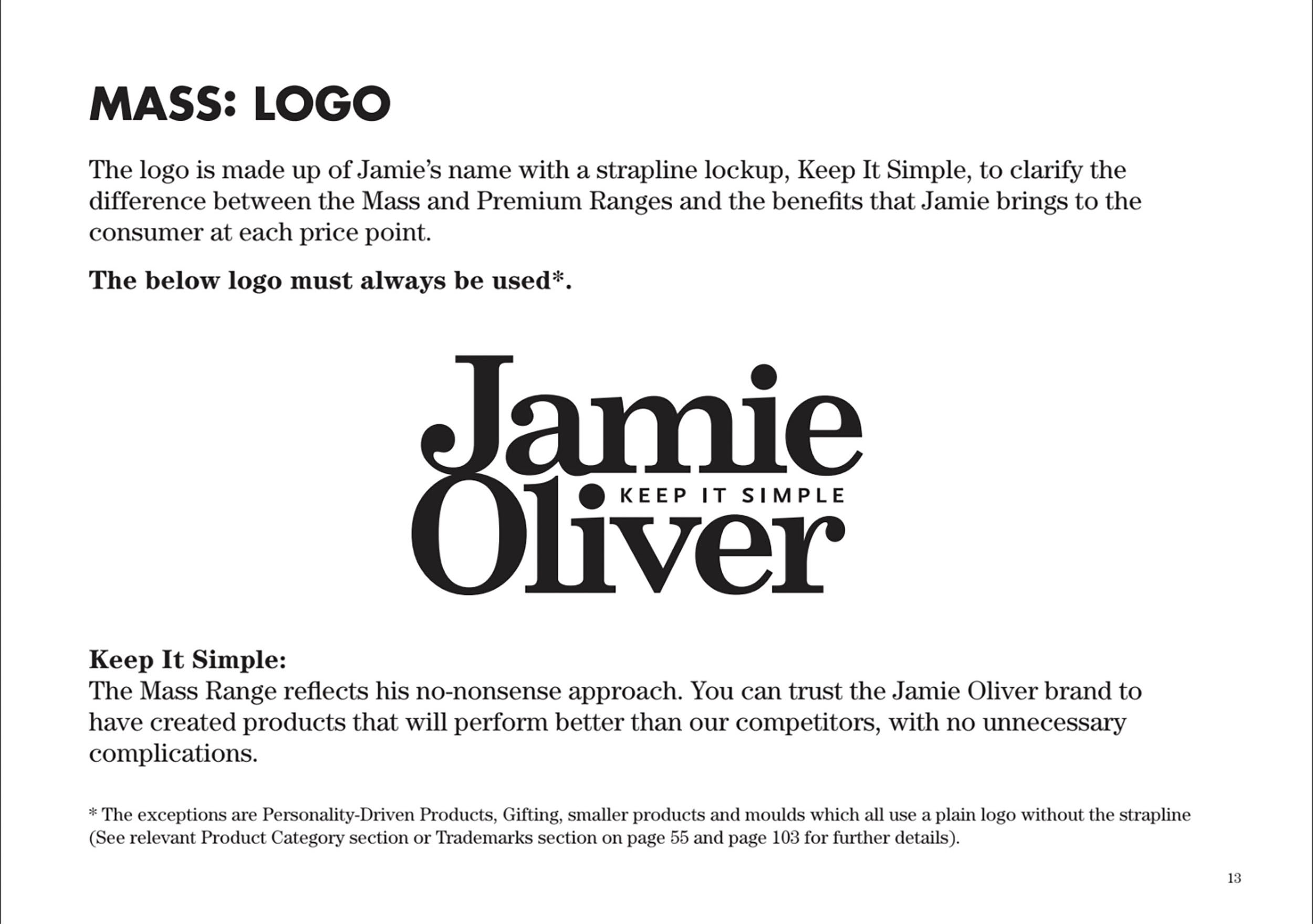
The brandbook of the famous chef consists of 2 big parts. The first one is dedicated to mass market and simple “Jamie”, the second one is dedicated to the chef Jamie Oliver. The brandbook introduces the personality of the hero and the personality of the brand. This document contains the most comprehensive information about the Jamie Oliver brand. Developers are asked to use the brandbook in packaging design, marketing support and point of sale, ensuring consistency of style across all brand identity media. As usual, emphasis is placed on the proper use of the Jamie brand, so are asked to refer to and adhere to the guide.
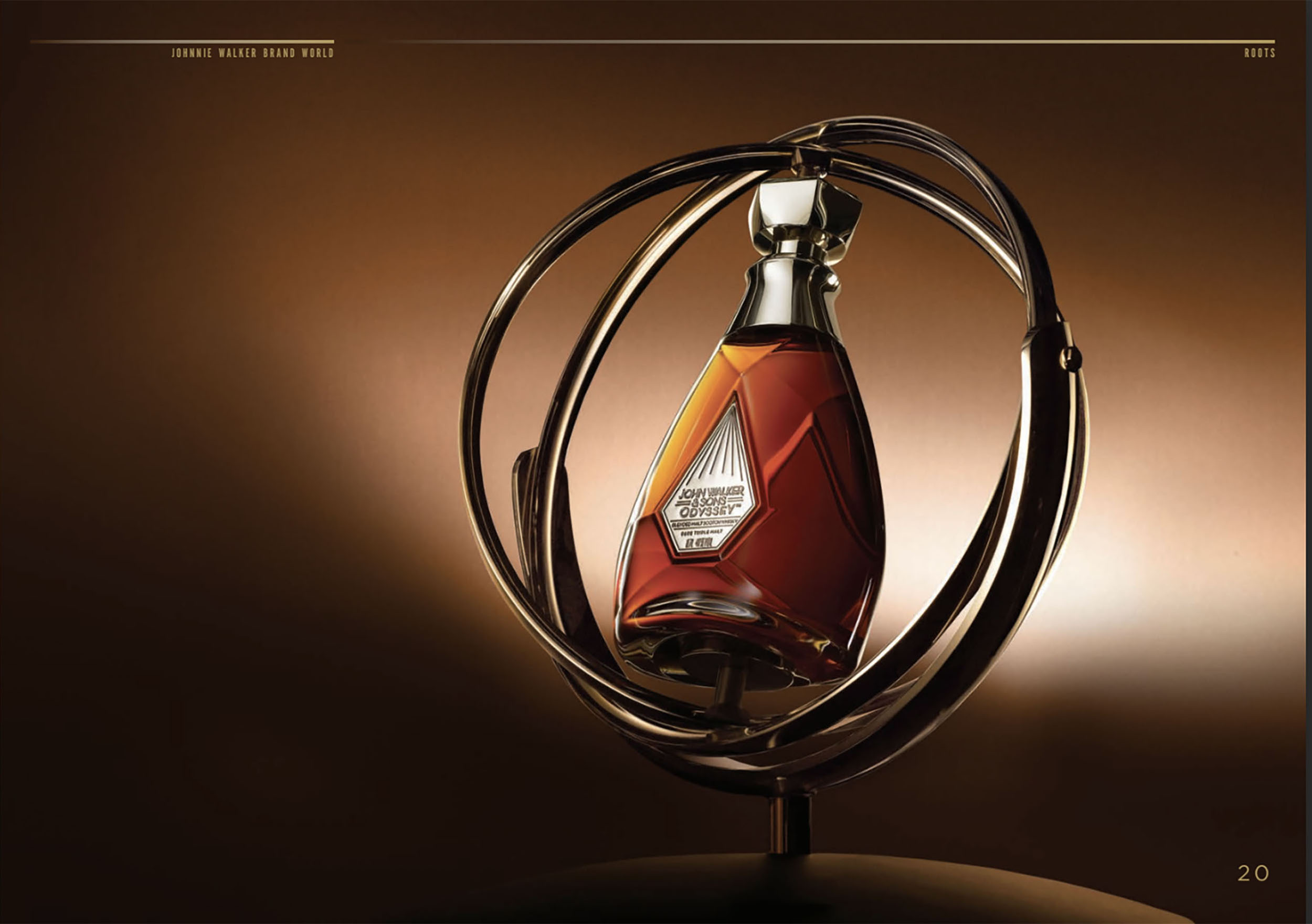
JohnnieWalker Brandbook
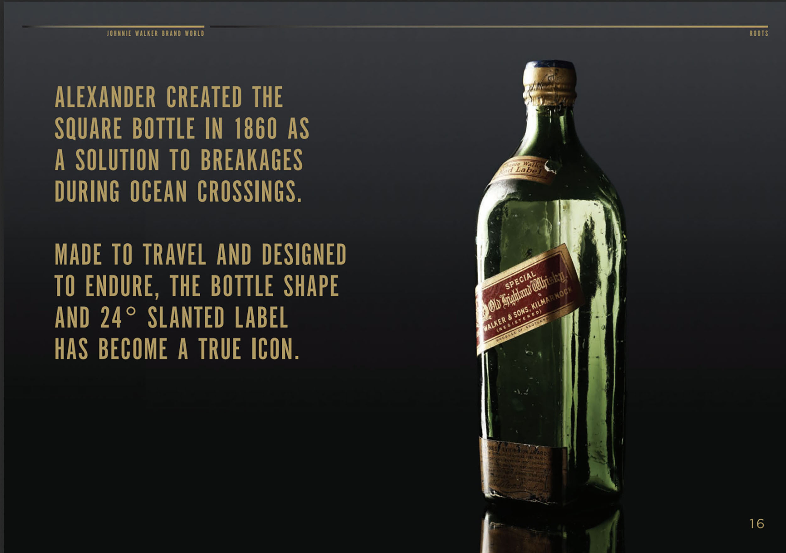
The first sketch of Johnnie Walker’s Striding Man was made in 1908 by artist Tom Brown on the back of a restaurant menu. “Colored” Johnnie appeared in 1927, thanks to Doris Zinkeisen. The artist chose his red tailcoat and painted him a light-colored cylinder.
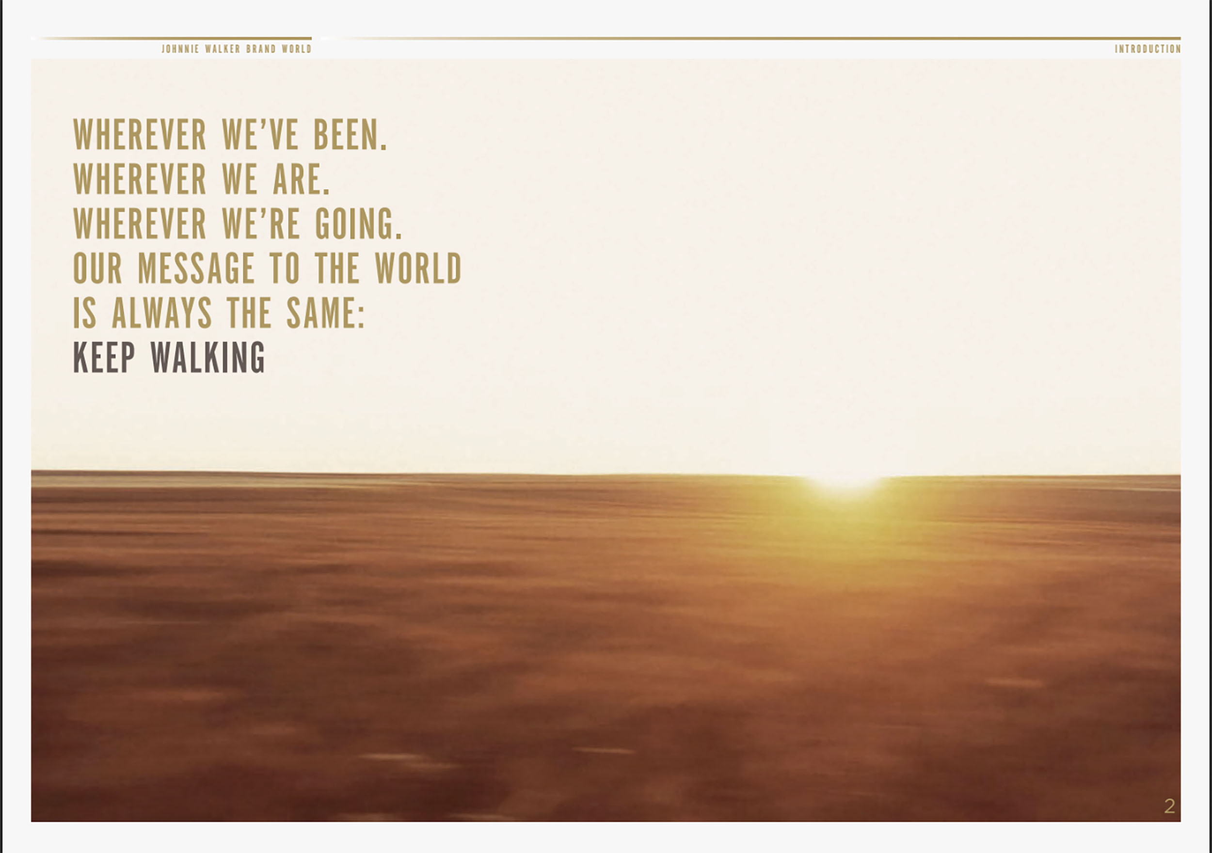
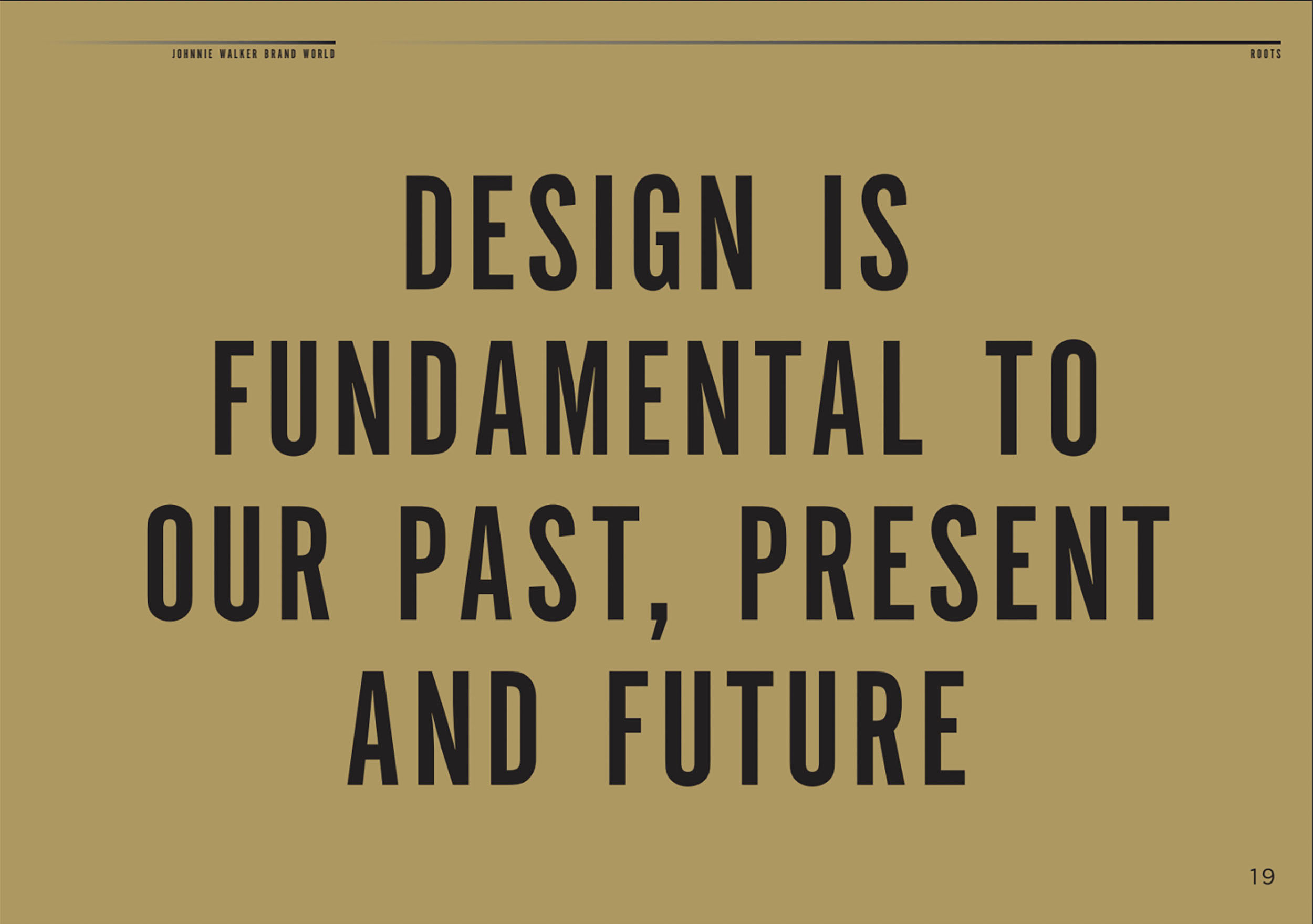
The main sections of a real brandbook are: history, brand character, mission, manifesto and brand wheel. Design is our past, present and future. There is no date on the brandbook, but you can check the time by “walking man”. In 2015, the brand and a simple drawing of the ‘walking man’ was finalized by London agency Bloom in collaboration with illustrator Gary Redford, so the brandbook is before the redesign.
Johnnie Walker is now the world’s largest whisky brand and its motto, as a joyful expression of optimism and as the best advice for you, is “keep going”.
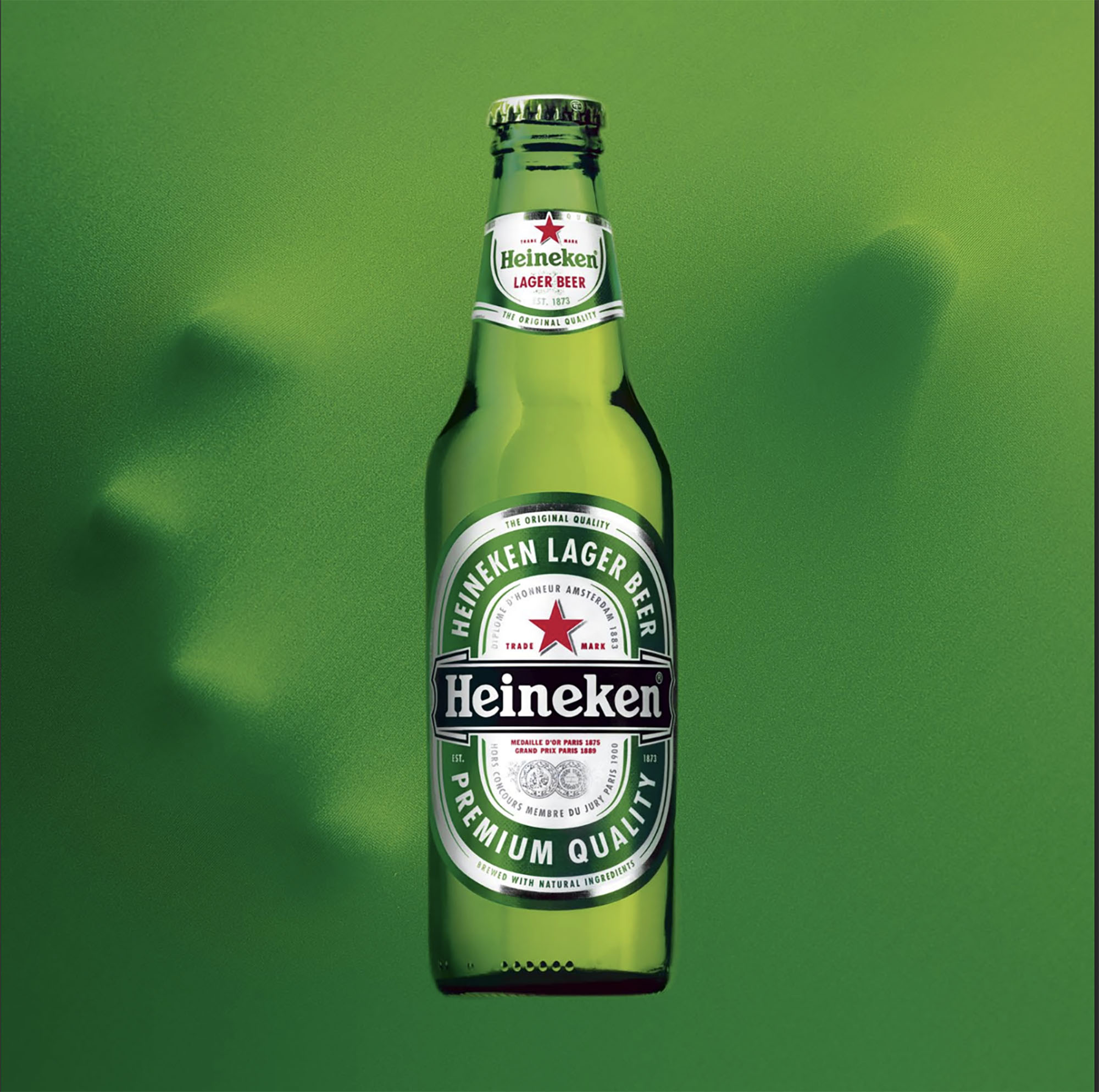
Heineken Brandbook
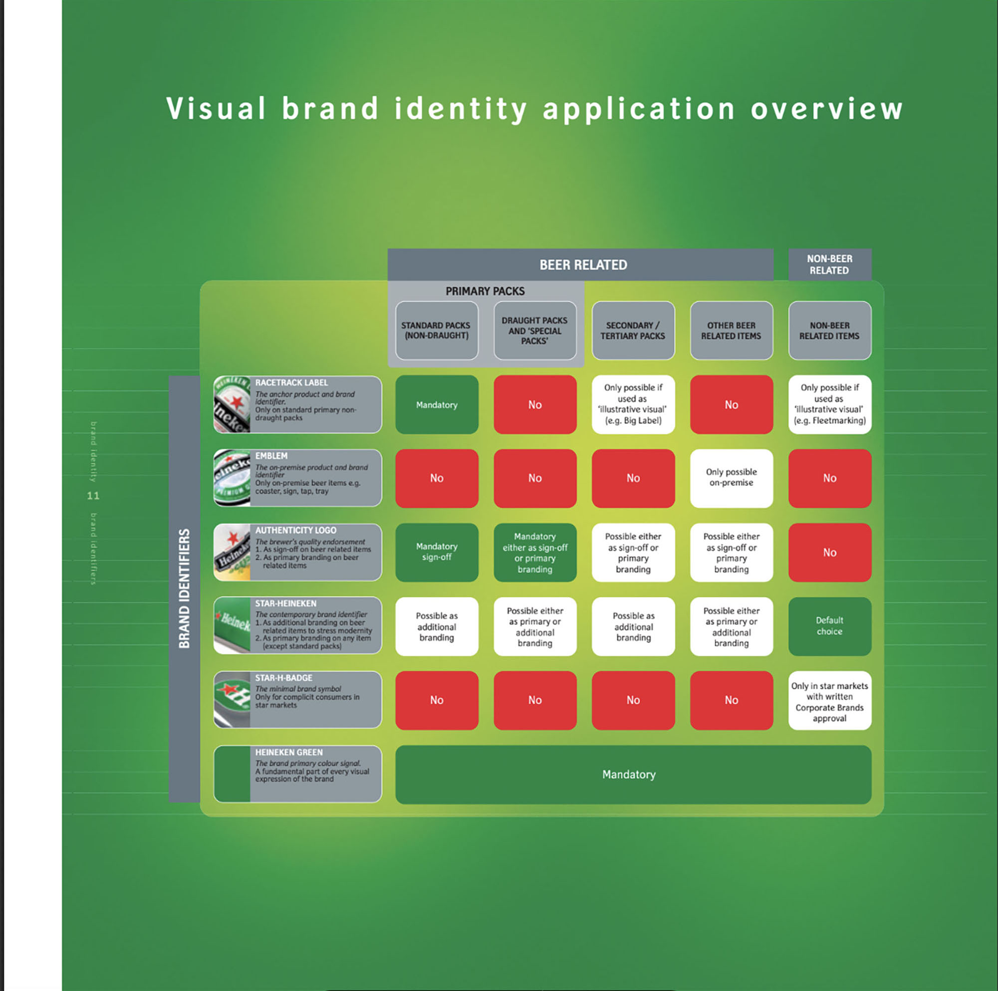
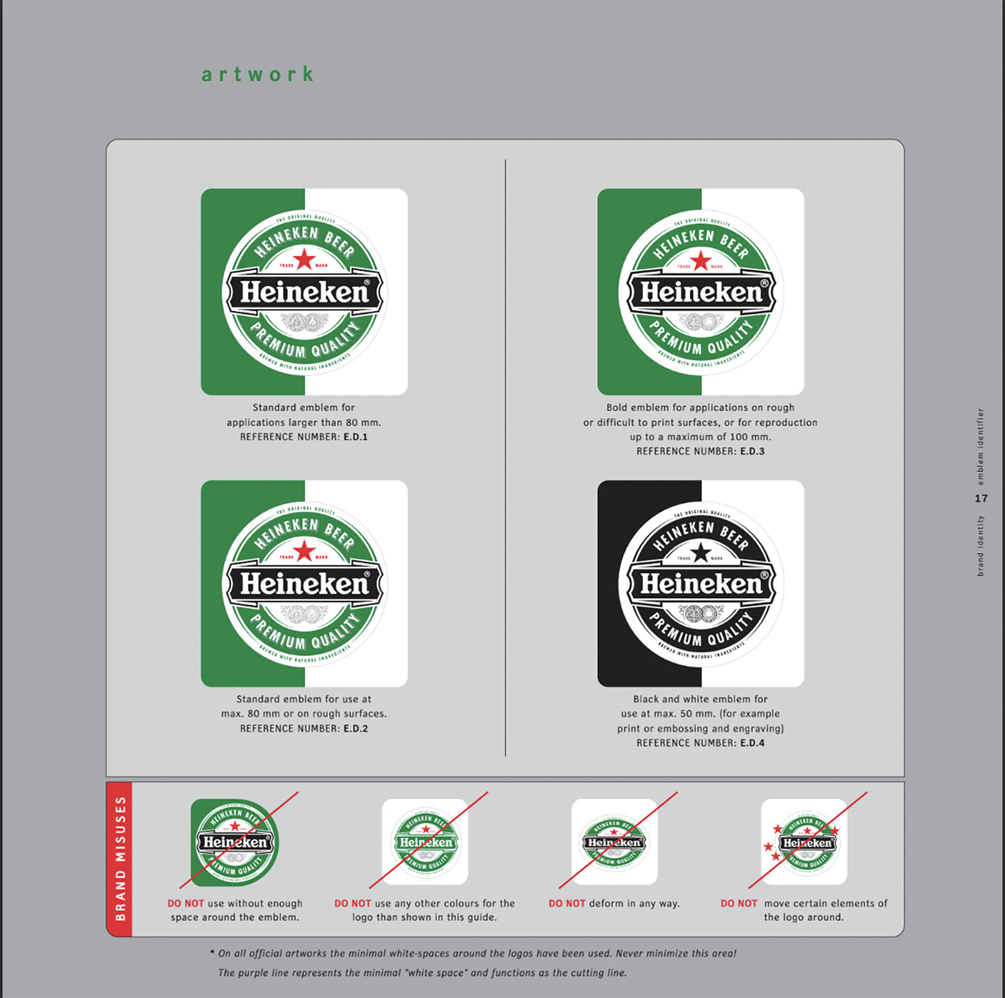
Heineken’s corporate identity plays a crucial role in maintaining and strengthening its number one position among international beer brands. The brand book presents a number of new rules and additional elements that have been added to the core elements of the identity, as well as additional style guidelines for photography.
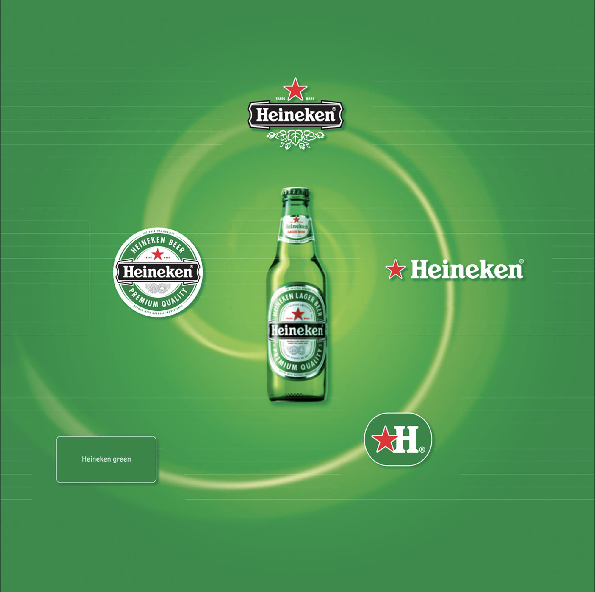
The book defines the key brand assets: the Heineken brand emblem, logo, star, star with “H” sign and the signature green color.
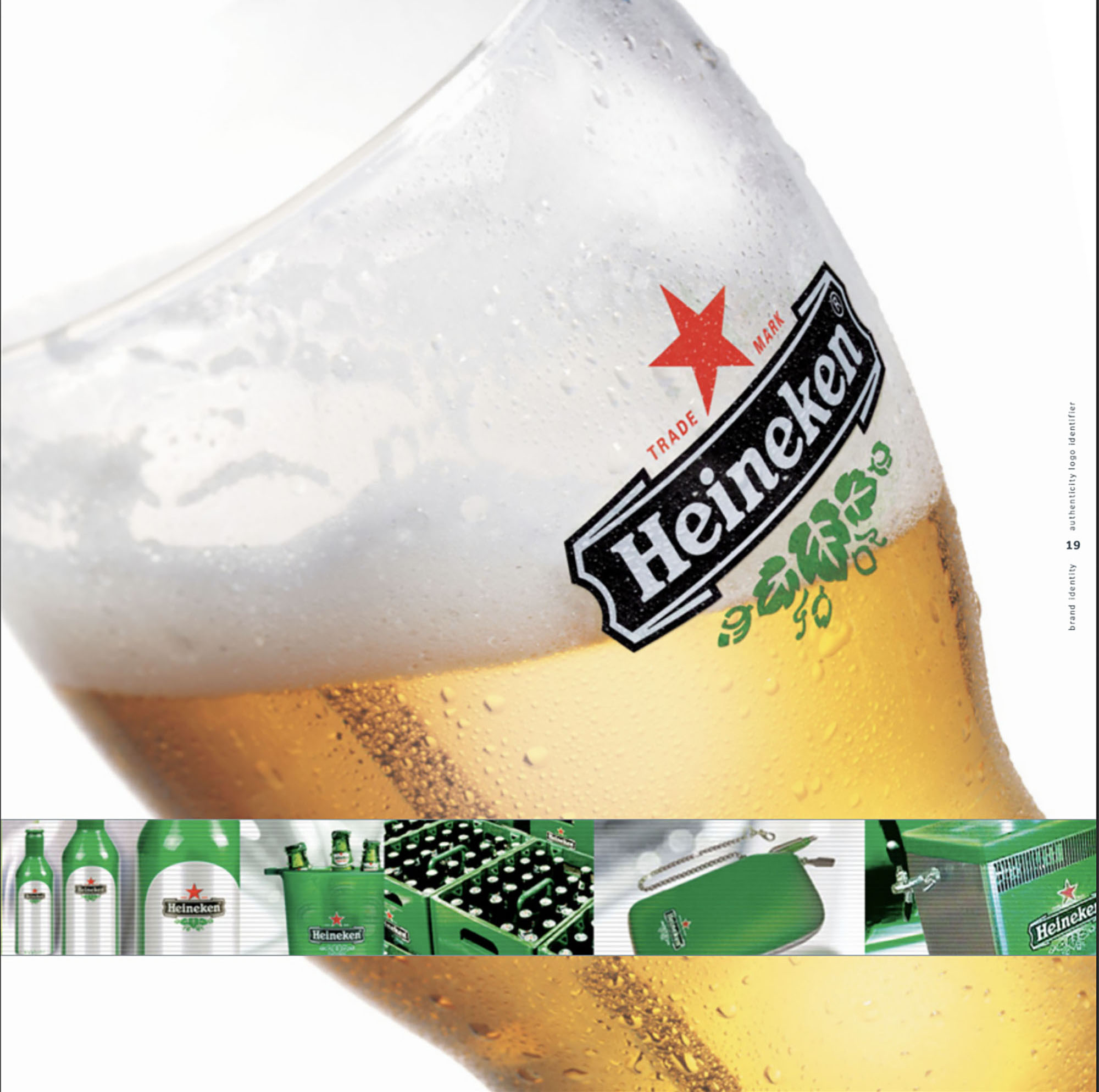
A large space in the book is devoted to the Heineken emblem. It consists of a green ring, a ribbon with the Heineken logo and a red star. The emblem is a key asset and conveys the authenticity and heritage of the Heineken brand.
The Heineken brand sponsors concerts, supports cultural events and promotes community events of all levels and sizes. That’s why you can see the bright green color and red star anywhere on the planet. Know that these are the main identifiers of the Heineken brand identity.
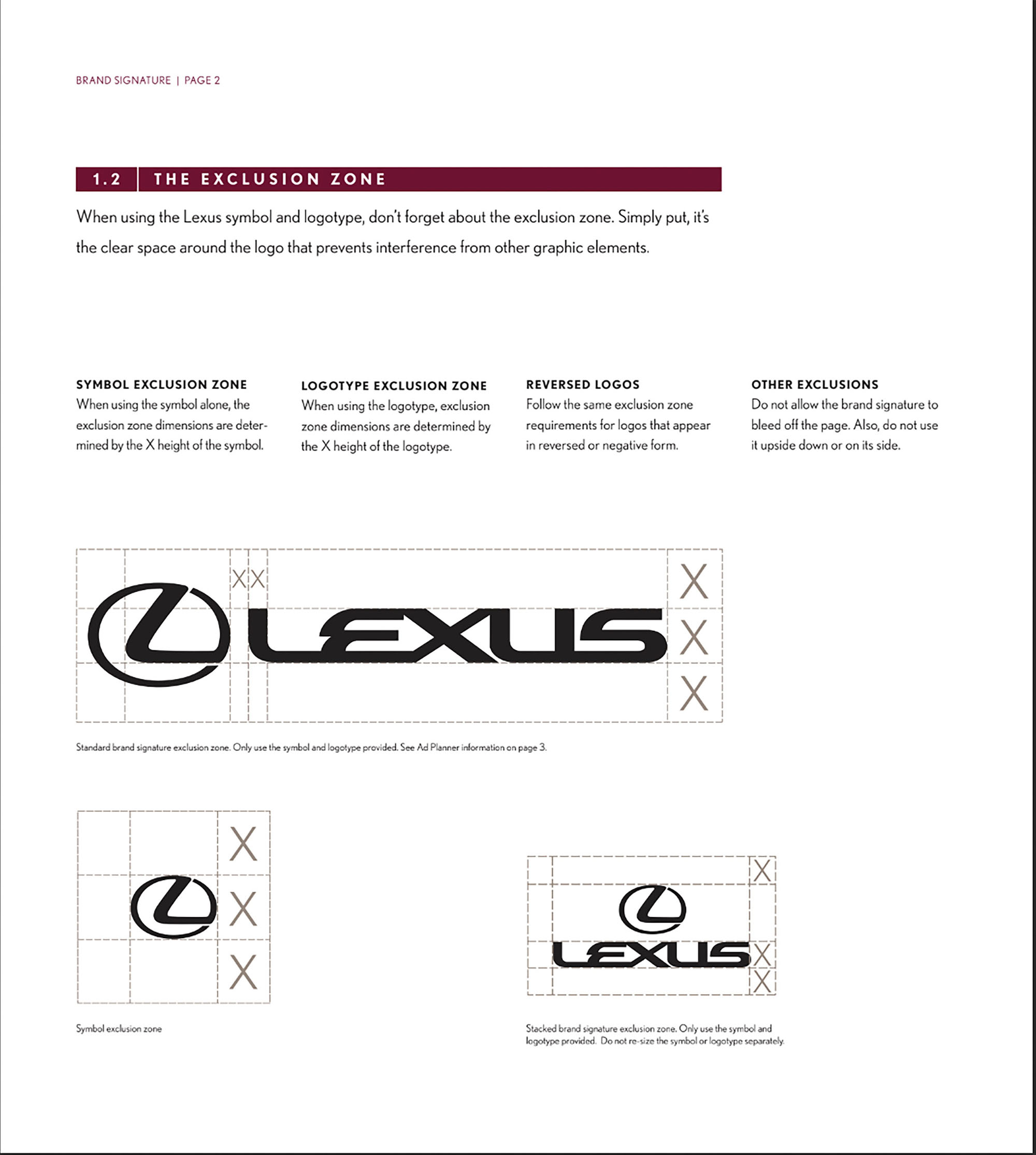
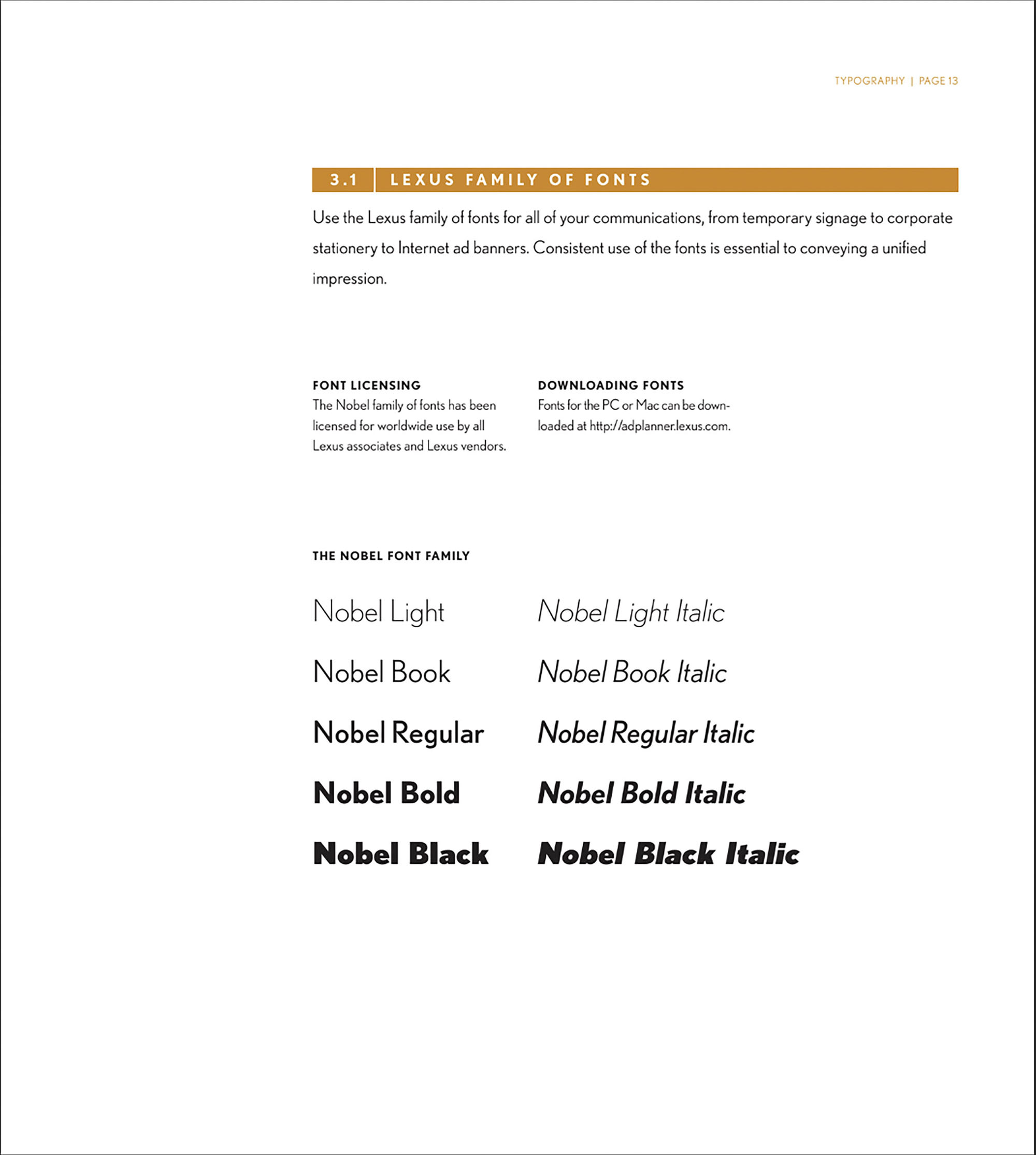
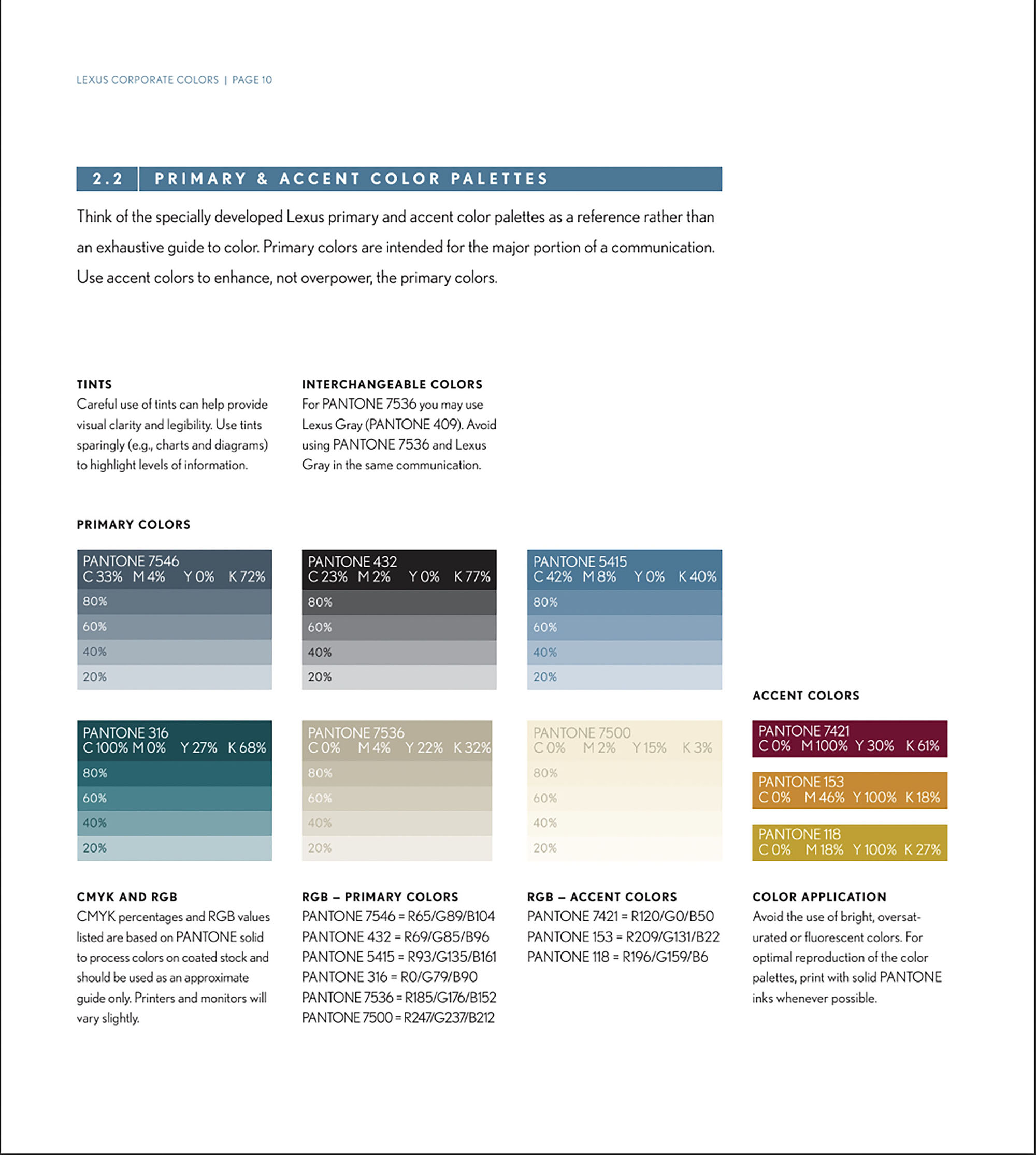
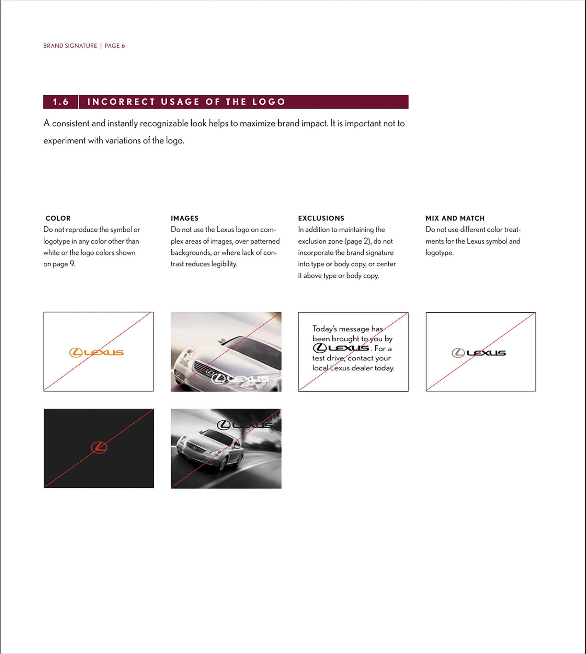
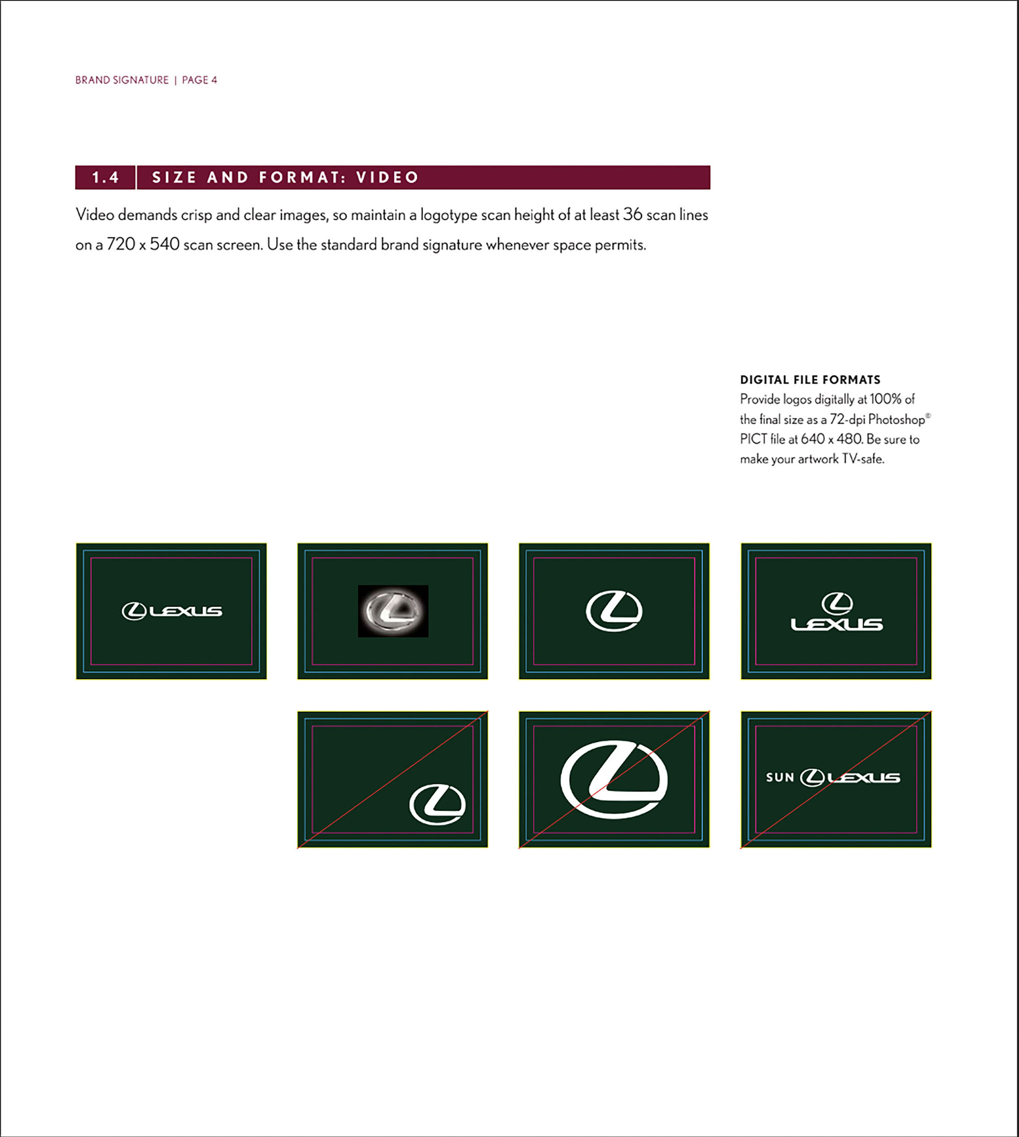
Lexus Brandbook
“Why did we create brand rules?” – ask the creators of the Lexus brandbook and answer: “We hope that through this guide, all Lexus associates will master the spirit and exceptional benefits that the Lexus brand provides. The book will convey the distinctive tone and personality that sets us apart from other, less passionate luxury brands. By reading the book, you strengthen the bonds of trust and add value to the Lexus brand.”
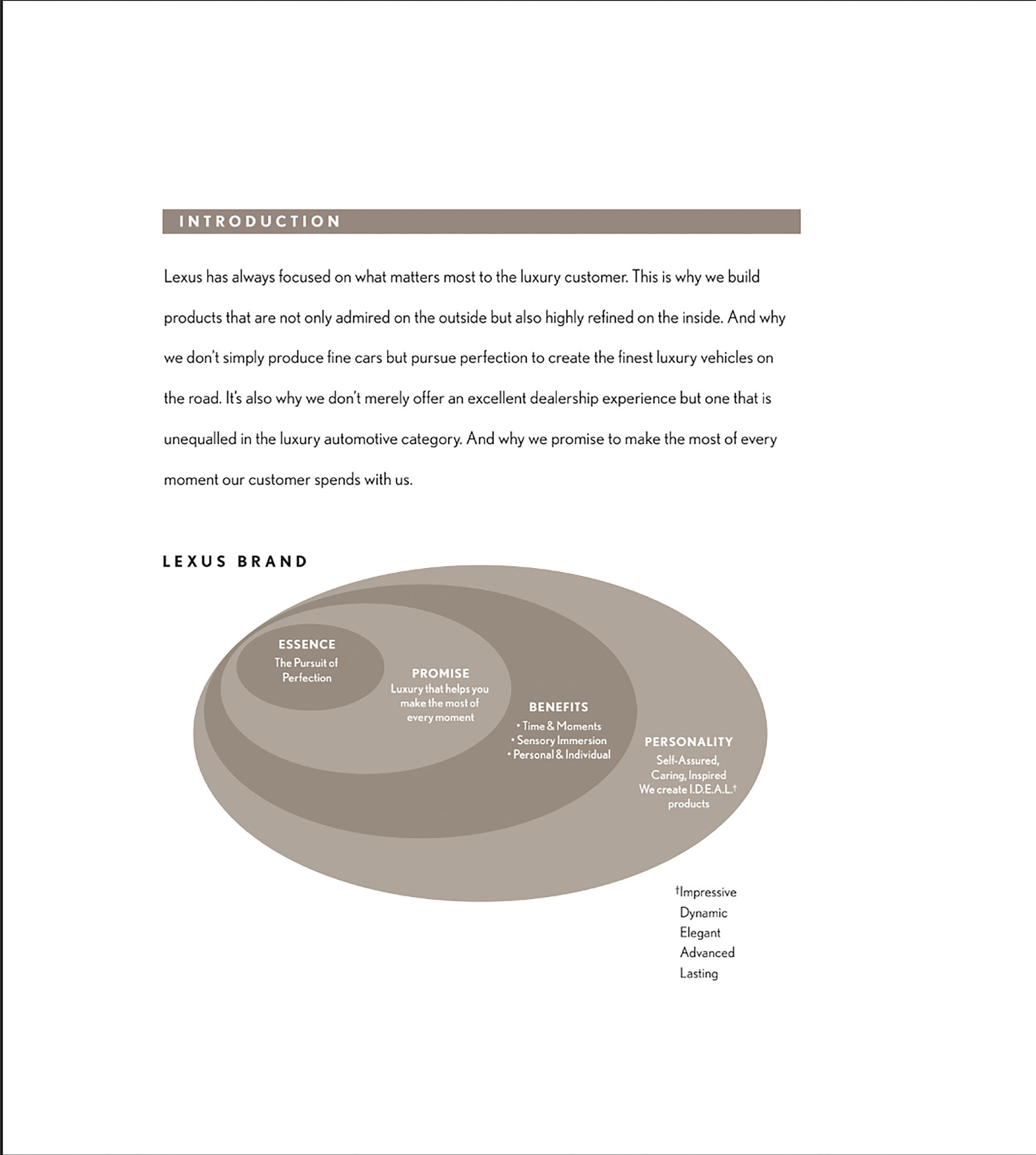
Great brands live in the hearts and minds of people. The successful ones form the foundation of strong relationships. Lexus is one of the great brands. We represent a company that is focused and passionate. A company that understands, cares about customers and guarantees a high quality of life with deep appreciation.
The essence of the brand is the pursuit of excellence. The Lexus nameplate symbolizes heritage and embodies the spirit of luxury. It is the face that the brand shows to the world. Developers are asked to treat it with respect and use it with common sense. The symbol and the logo create the brand unit. The combination of the two registered trademarks is an important asset to the Lexus brand and cannot be changed. The brand block is the only visual constant in communicating the Lexus brand.
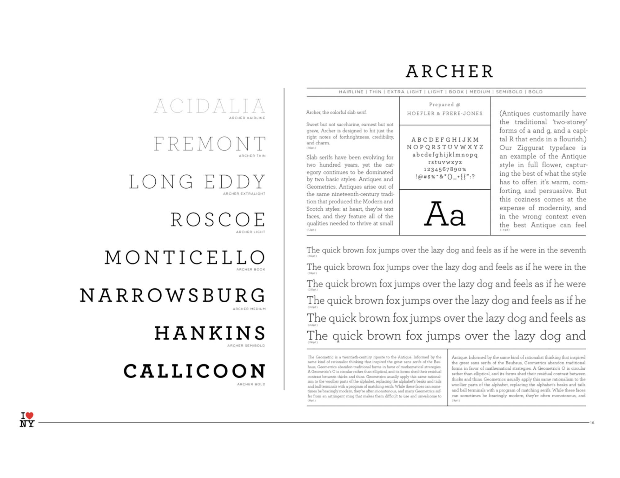
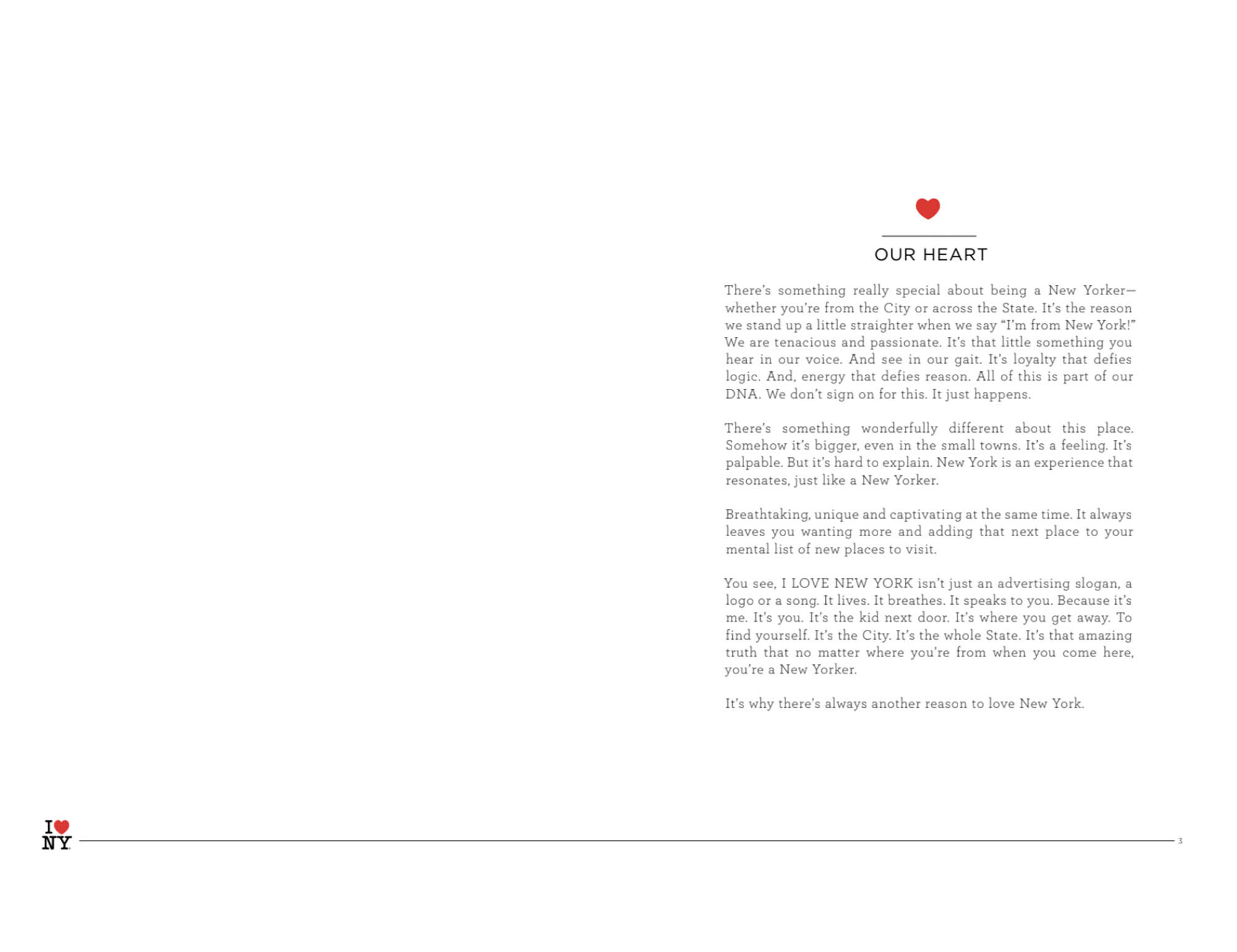
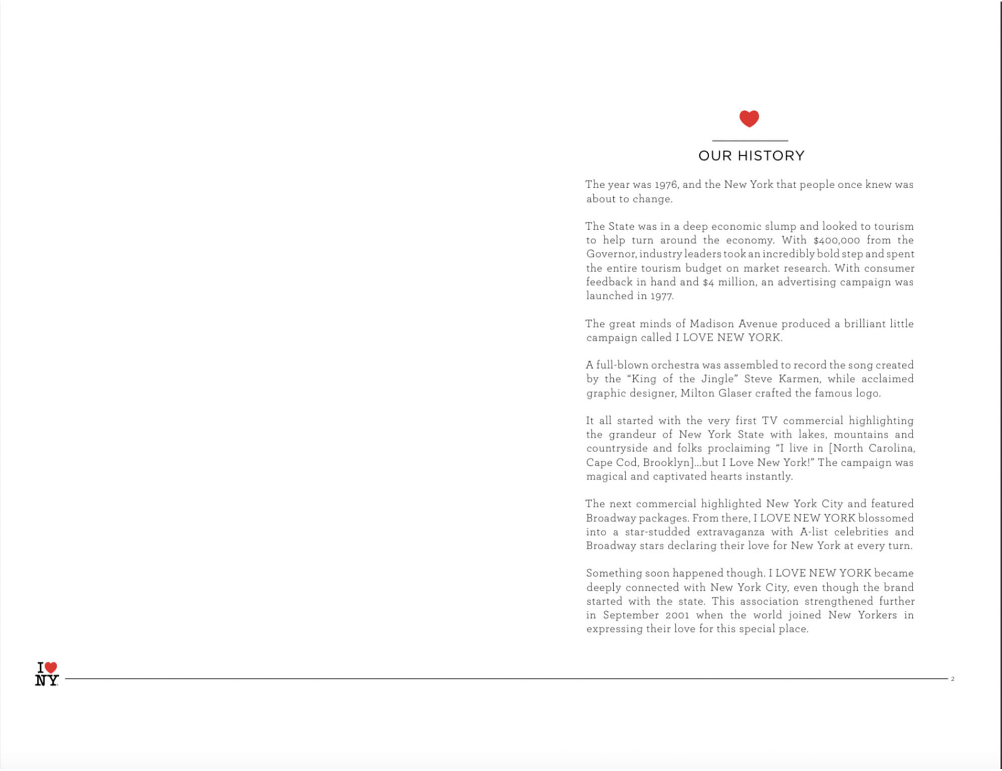
I Love New York Guideline
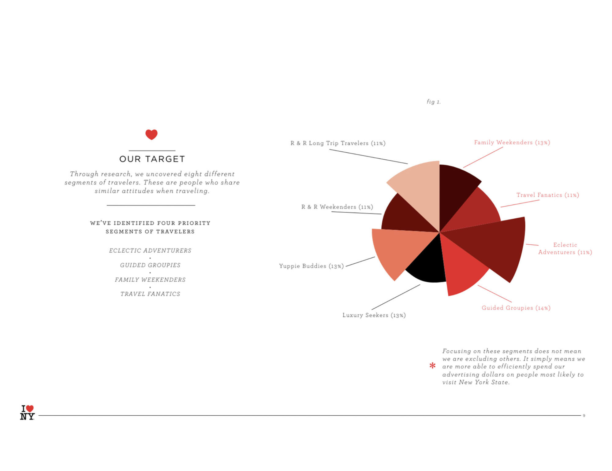
“I Love New York” is a well-known all over the world logo designed in the 70s by Milton Glasser to create a new advertising image of New York tourism. There is a legend that the logo was created by the designer while sitting in the back seat of a taxi.
The logo is a rebus of a capital ‘I’ (I), a red heart symbol (♥) and an abbreviation of the name of the city of New York, typed in the then popular American Typewriter headset (retro typewriter style).
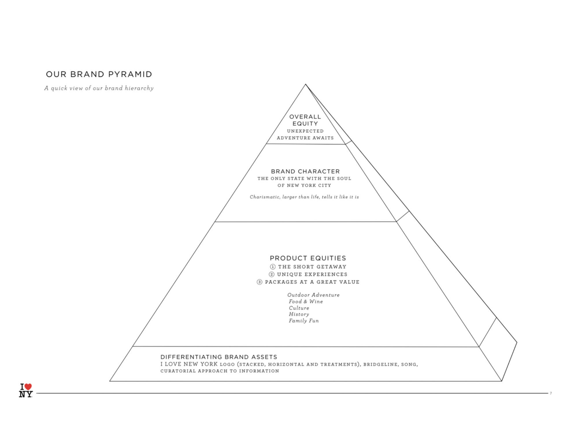
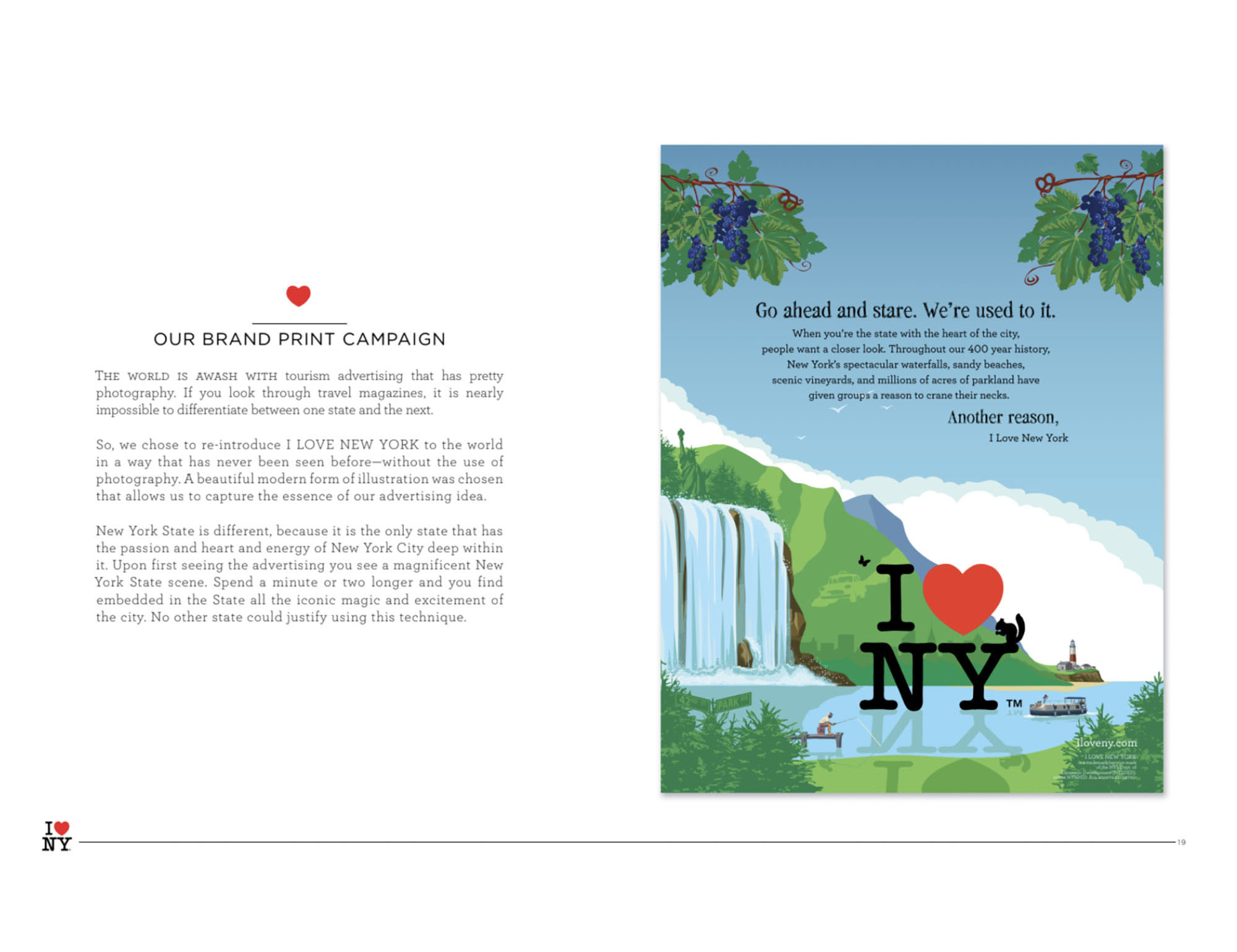
This brandbook was created in 2008 to tell everyone who touches the brand about the new principles of advertising image of the city and the state. The book talks about the importance of being consistent in branding. The authors cite research that proves consistency builds awareness and helps strengthen the emotional connection to a brand. “The more purposeful we are, the more powerful the I LOVE NEW YORK brand will be. It’s that simple.” The purpose of the brand book is simple – to share all the treasures that New York State holds. The brand book talks about the brand platform, mission and values.
A very interesting sample of the New York State brandbook. I suggest you pay attention to those designers or marketers who are tackling territory branding. Some sections, such as “Advertising”, do not stand up to criticism from the point of view of modern graphic design. But be indulgent, the document is more than 10 years old. Interesting variation of the logo for different seasons of the year in the section “Logo rules for different seasons”.
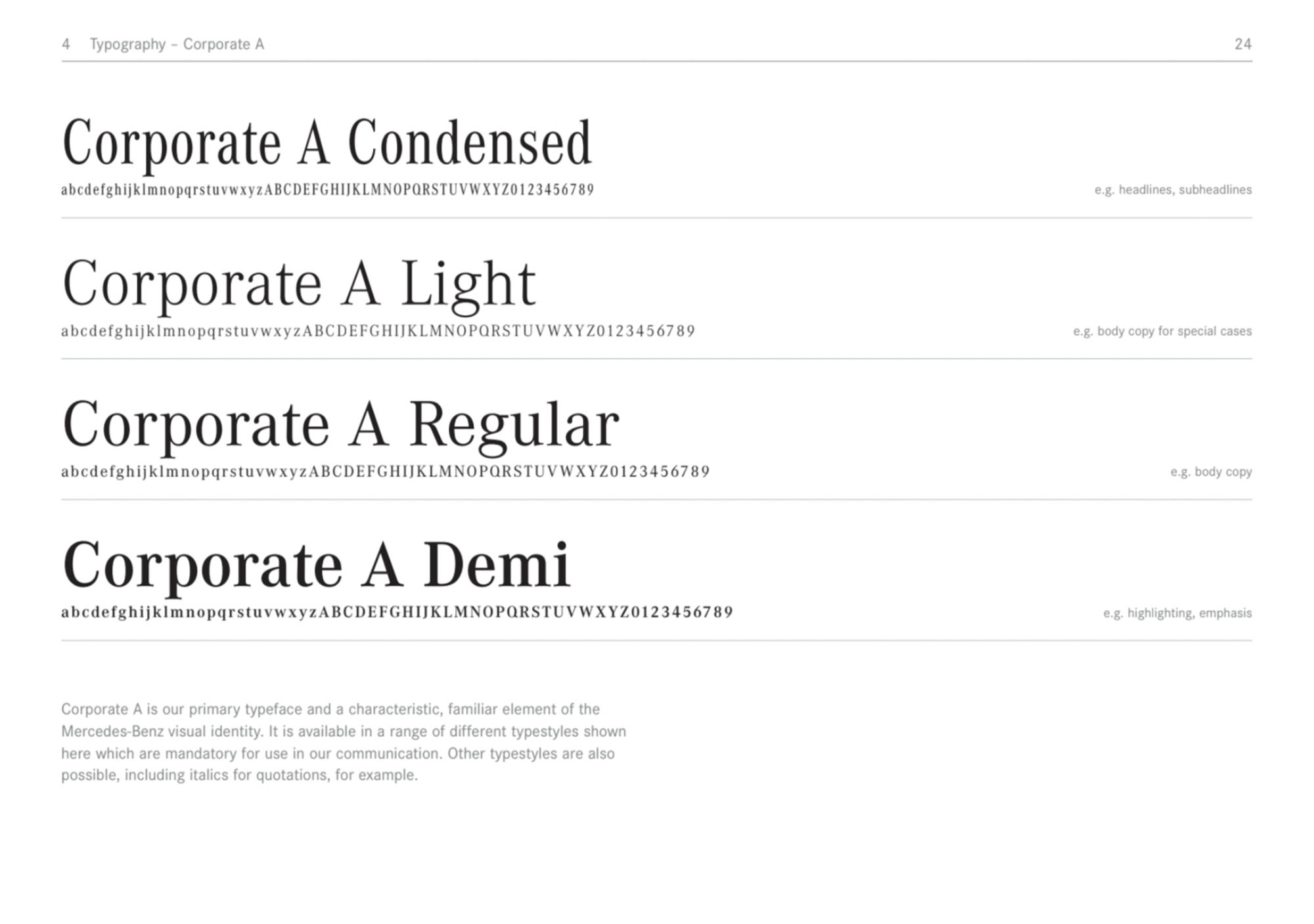
Mercedes-Benz Guideline
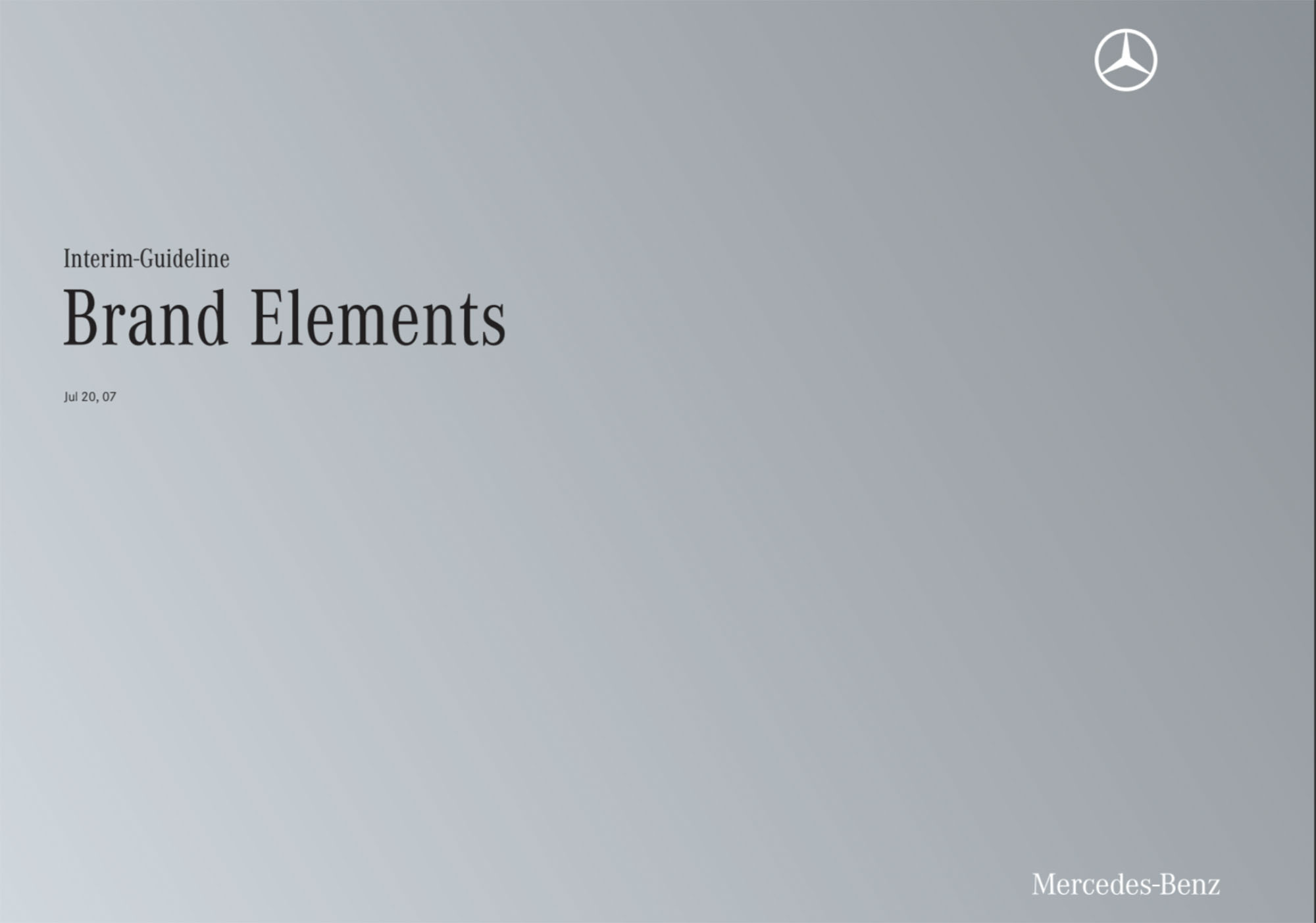
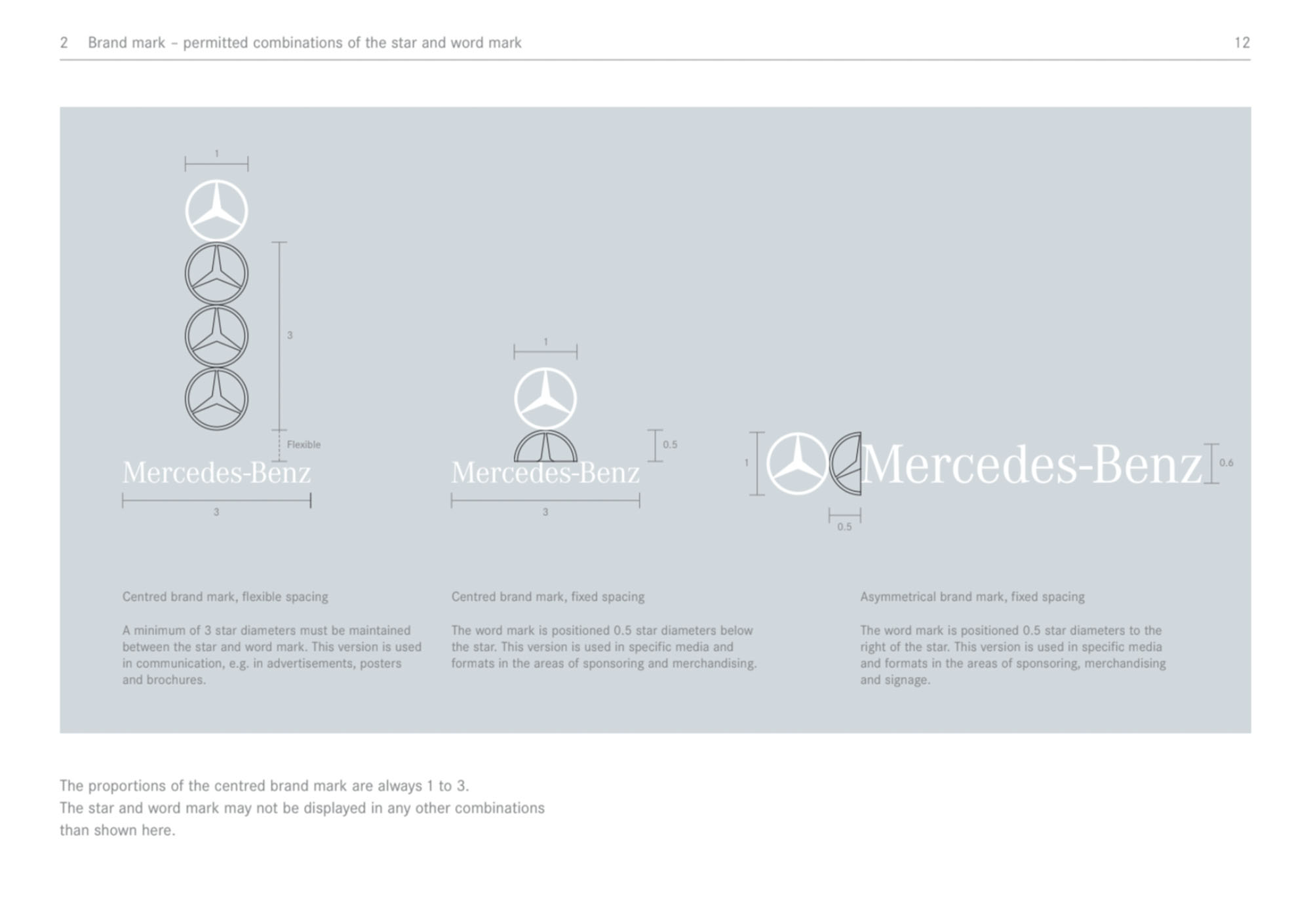
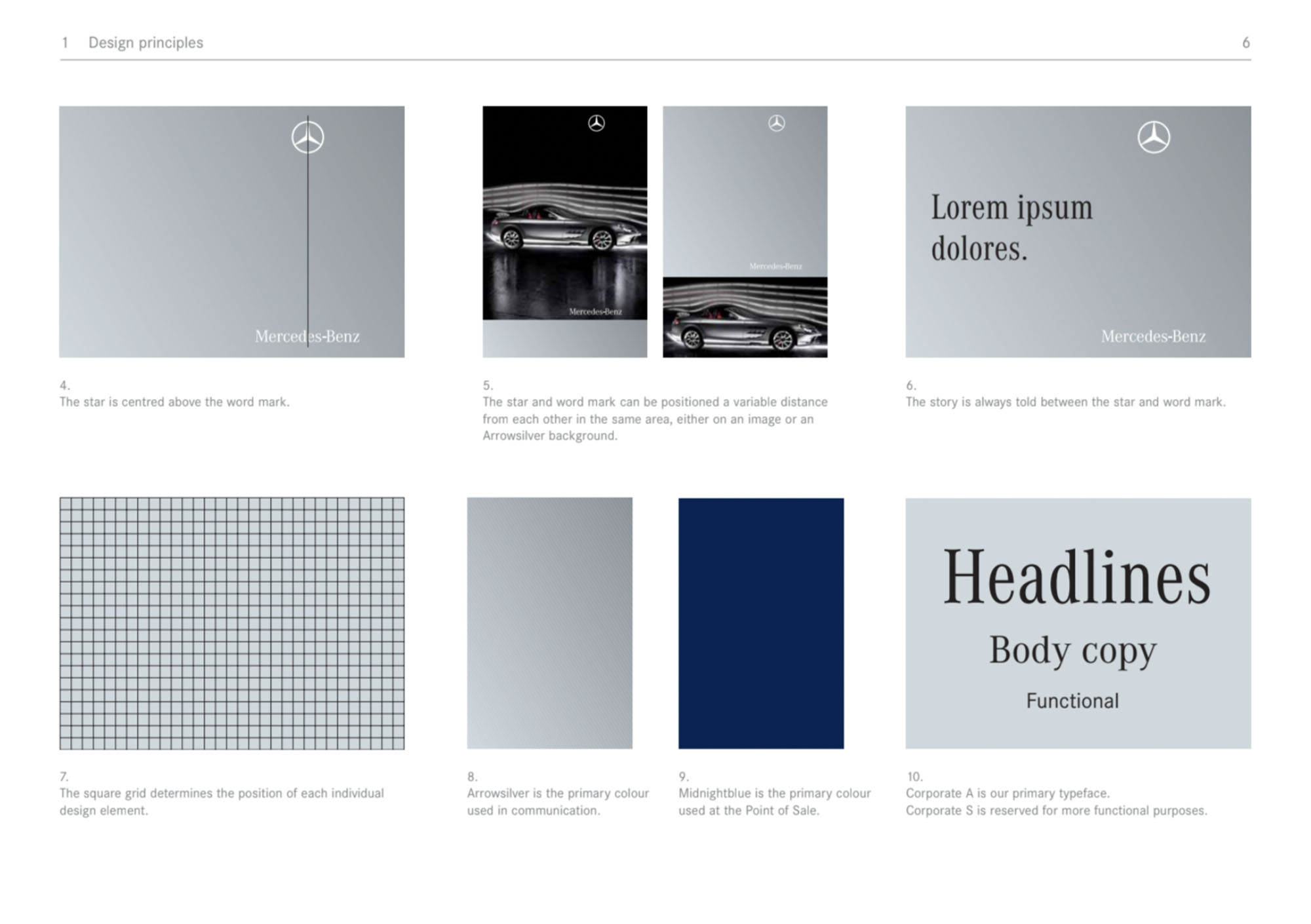
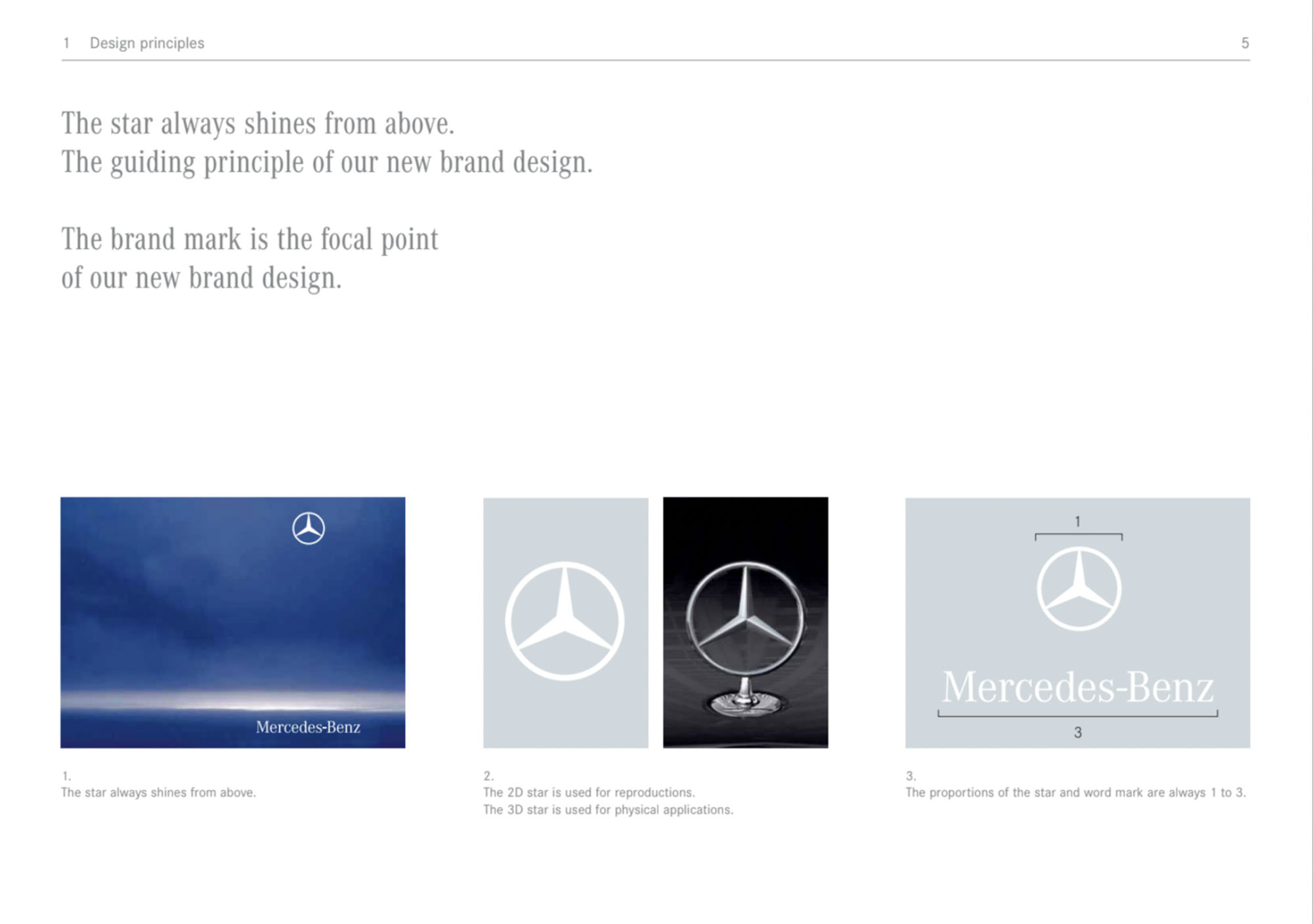
The Mercedes-Benz corporate identity manual contains 3 sections: basic principles, applications and co-branding.
The Mercedes-Benz document is an updated version of the corporate identity manual and emphasizes three main facts: the new location of the star, the separation of the star with the logo and the introduction of the black color. The authors introduce new concepts in visual style: clarity, sensual layout and simplicity.
The black background acts as a new element of style. Panorama is a variant of the background layout scheme that can be used in both print materials and videos. In addition, there is a three-dimensional background with the Mercedes-Benz star, word mark and slogan.
It is worth mentioning another brand asset that the developers do not emphasize – the Corporate A brand font, which is another key asset of the Mercedes-Benz brand.
Pepsi Brandbook
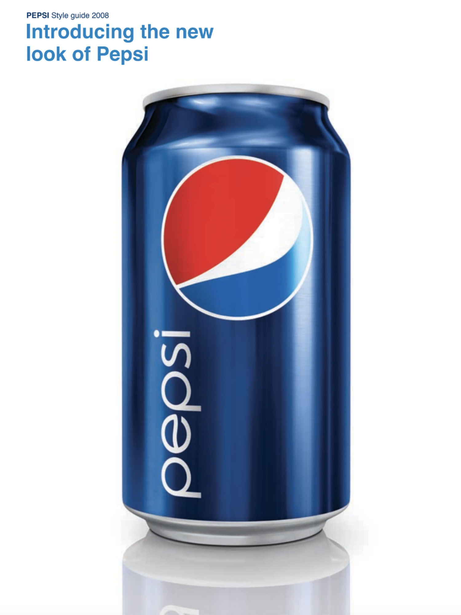
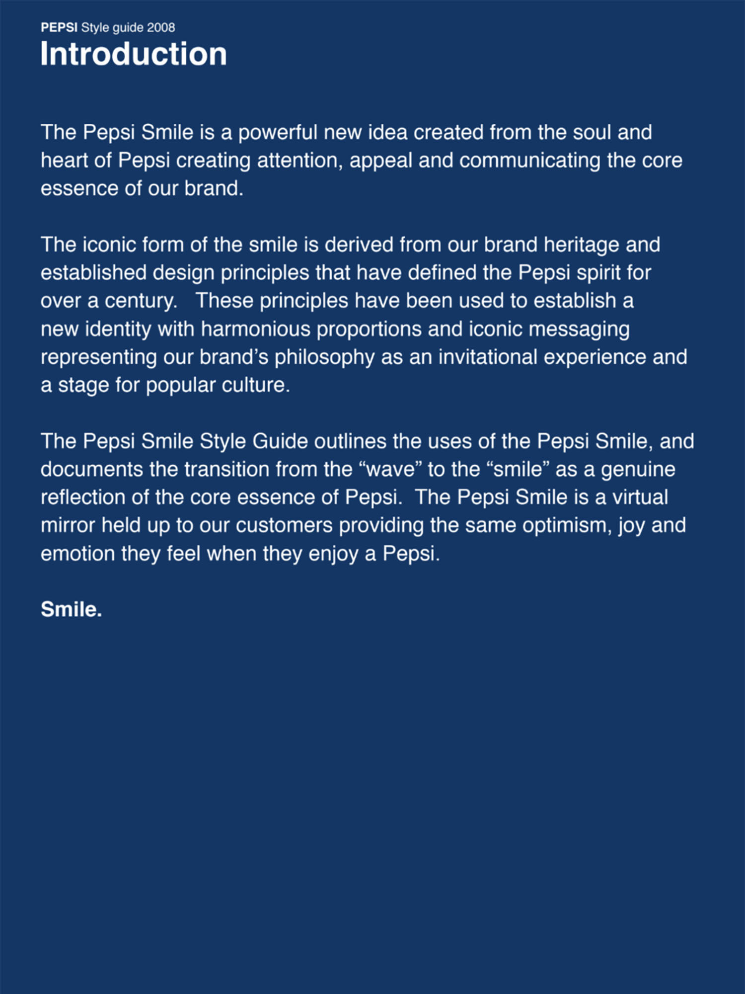
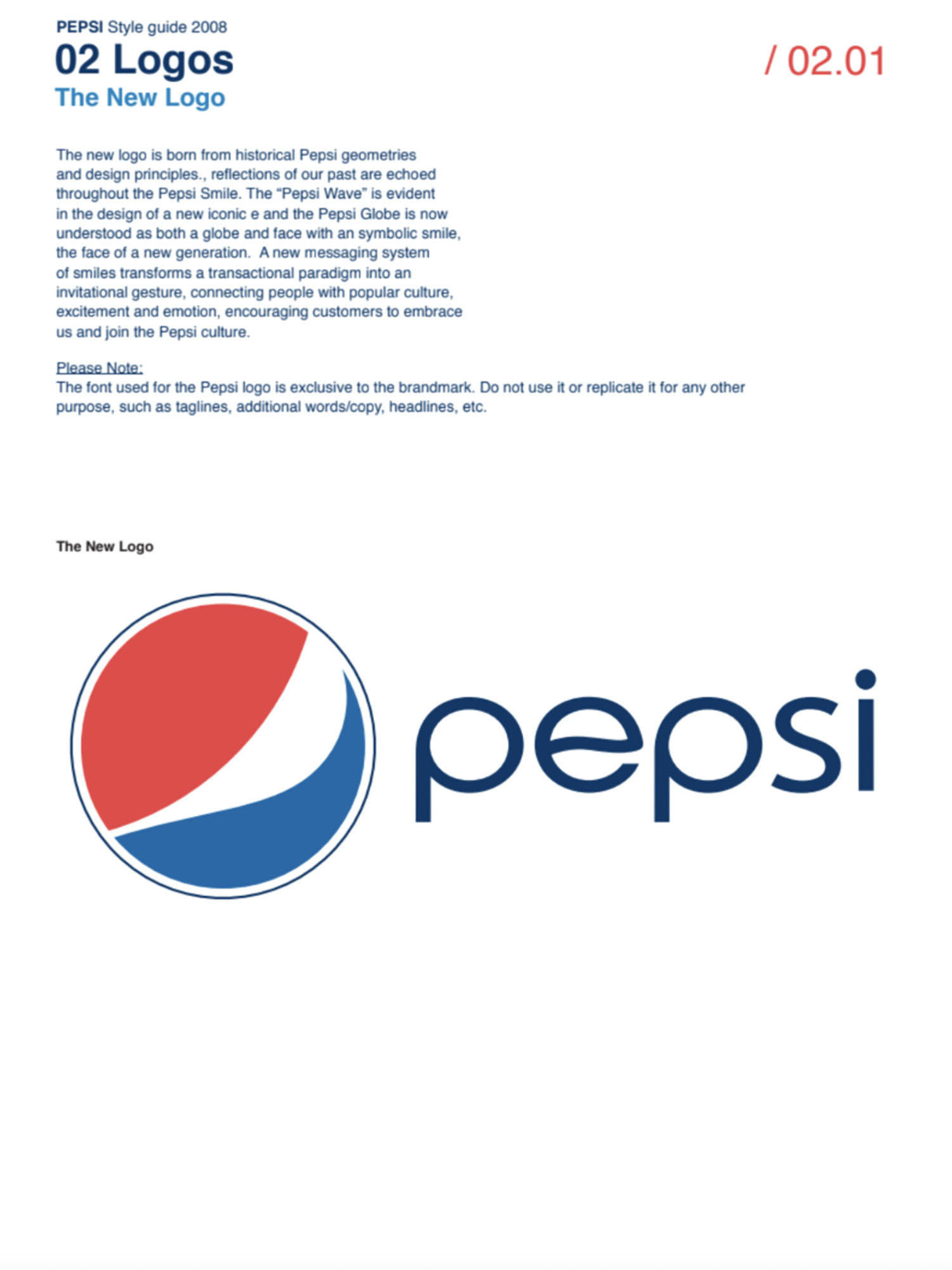
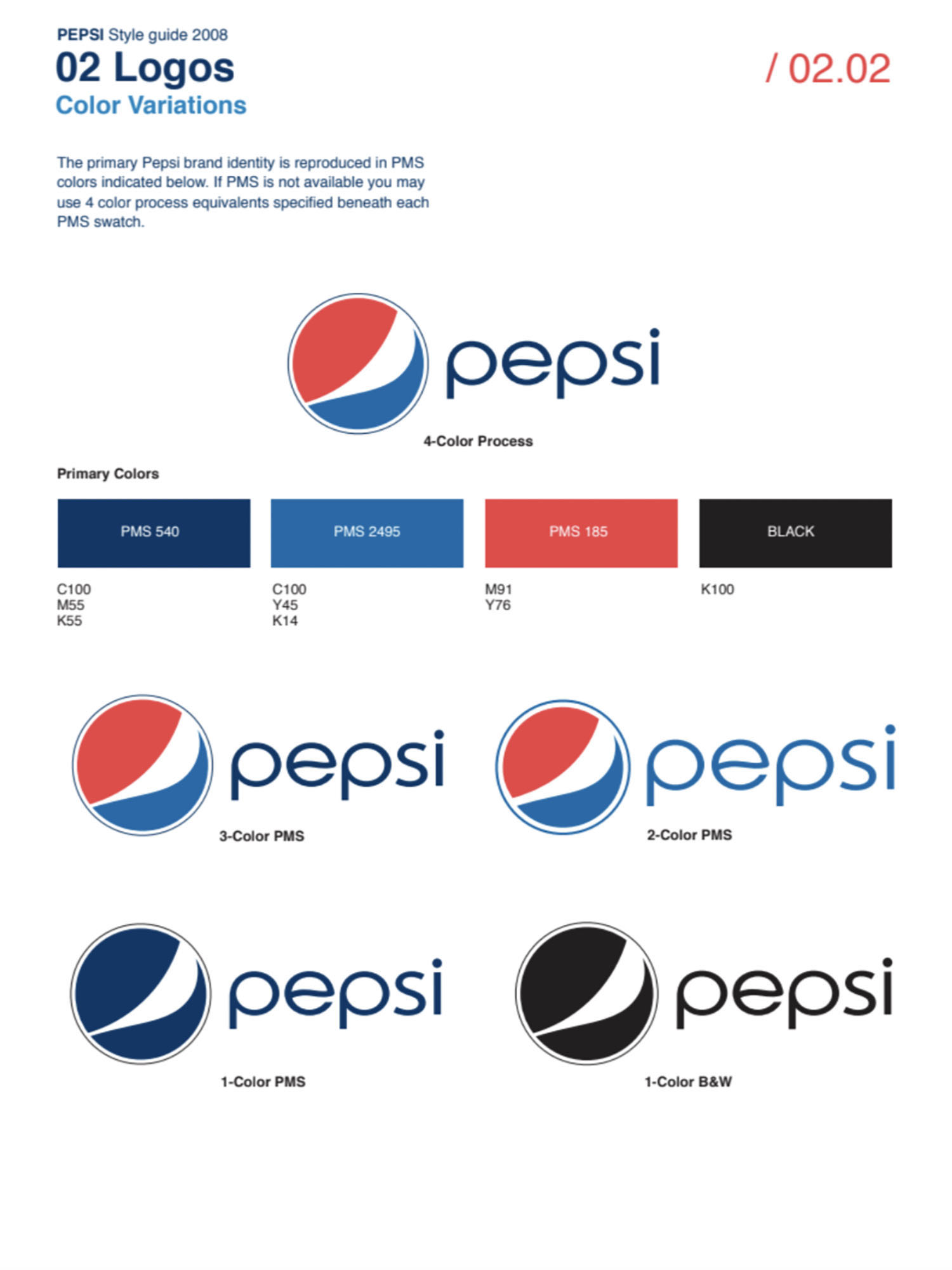
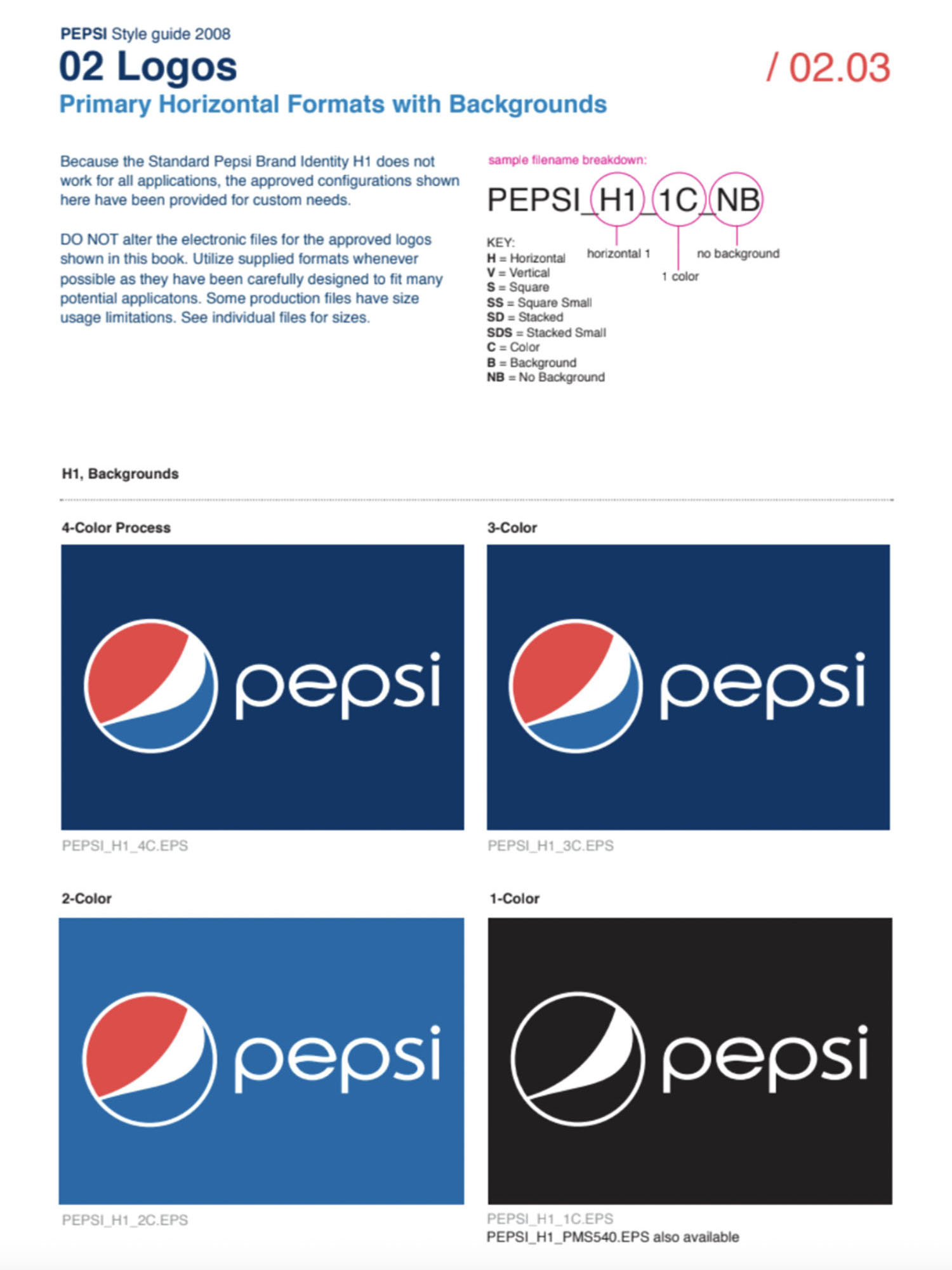
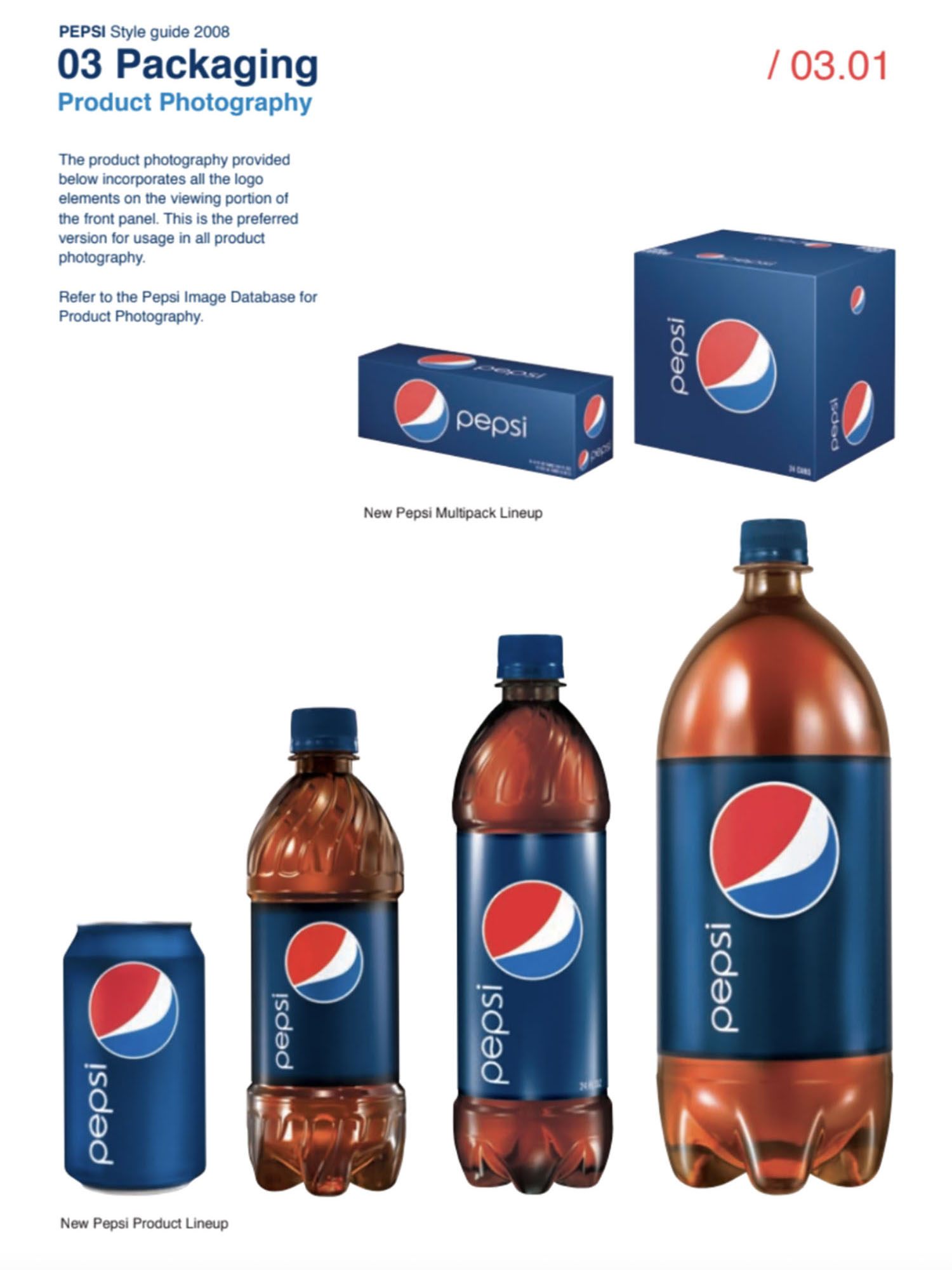
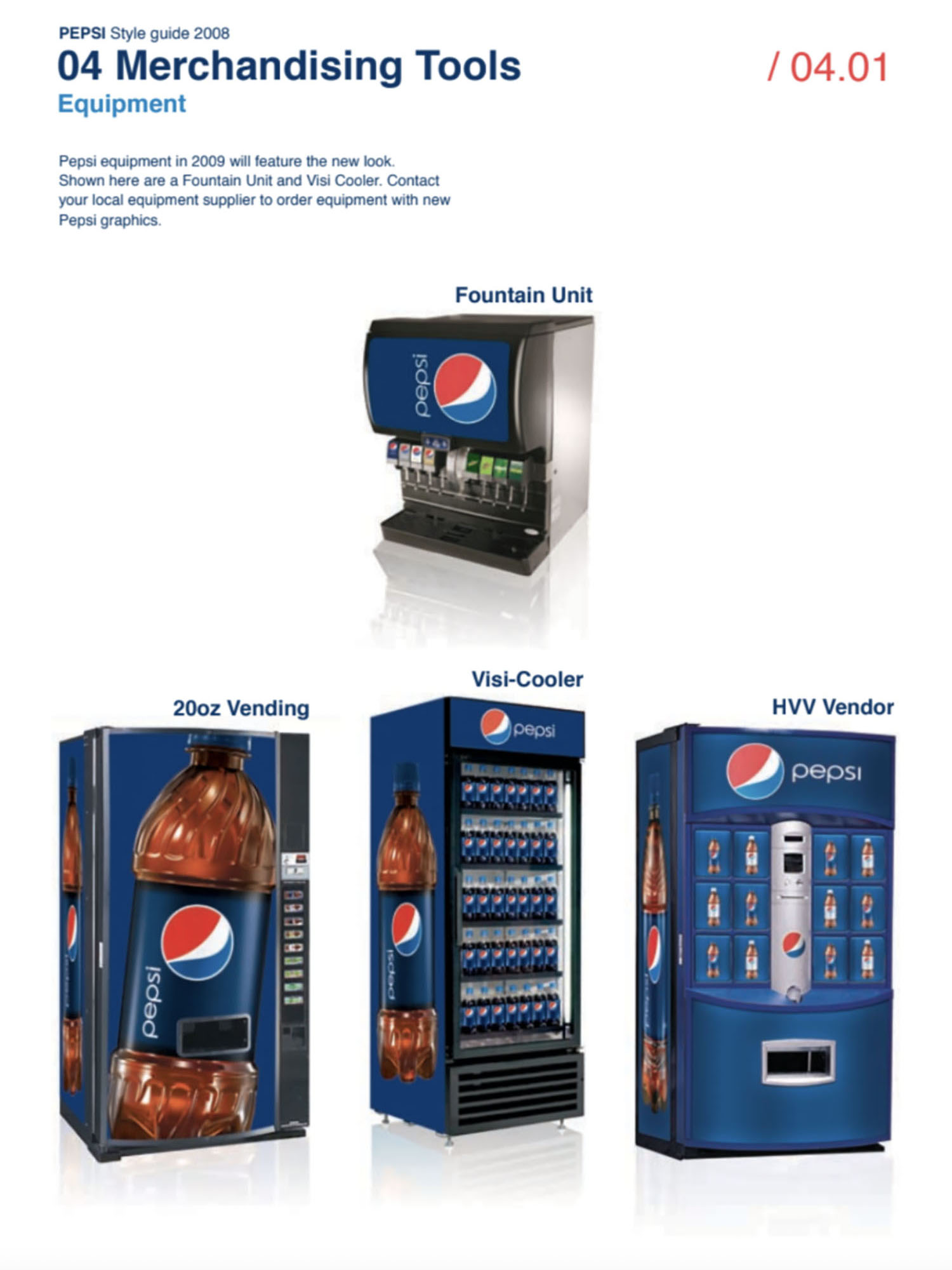
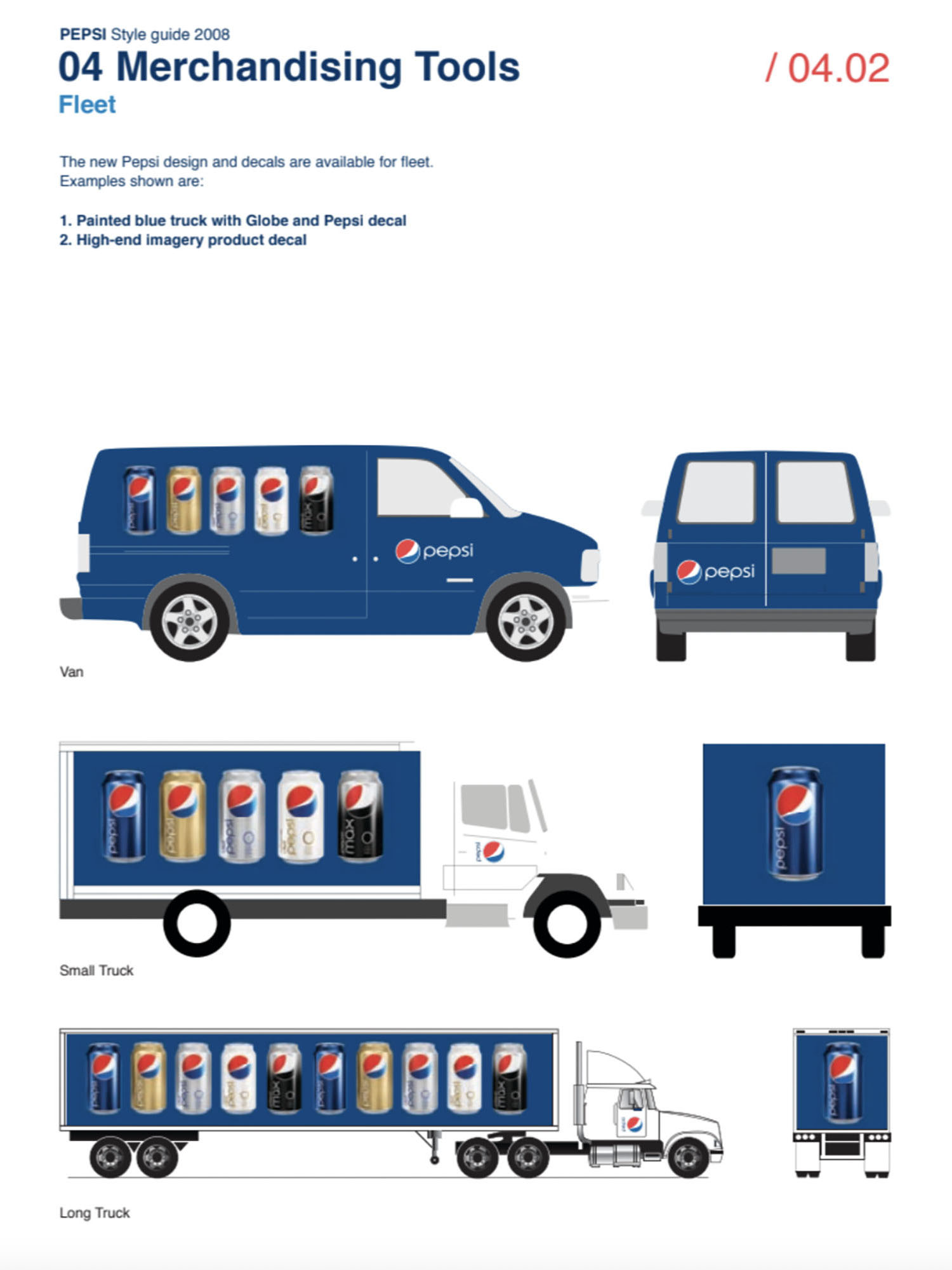
In 2008, Pepsi rebranded and presented a new logo, which is in the form of a smiley face. The idea was that each drink was assigned a smile. Pepsi MAX is a wide smile, Pepsi is a medium smile, and Pepsi Light is a light smile. The idea didn’t catch on and one variation for all drinks caught on.
Pepsi’s brandbook is dedicated to the rebranding and the new smile. The company’s marketers considered it a powerful idea, capable of attracting attention and conveying the core essence of the brand. The iconic smile shape is based on Pepsi’s brand heritage and established design principles that have defined the Pepsi spirit for over a century. These principles were utilized to create a new identity with harmonious proportions and an iconic message. Pepsi’s new brand identity guidelines describe the use of the new symbol and govern the transition from “wave” to “smile,” reflecting the core essence of Pepsi.
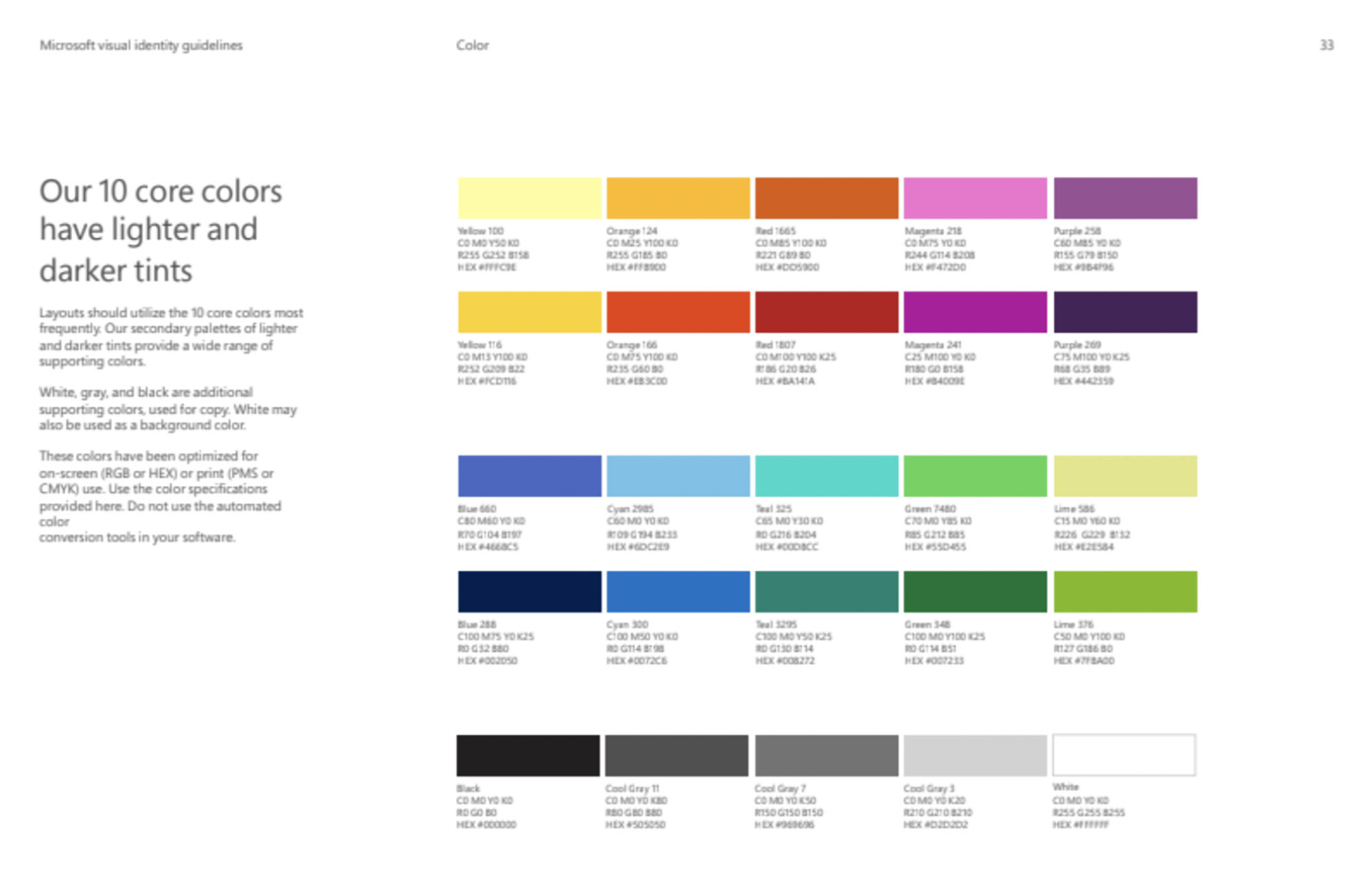
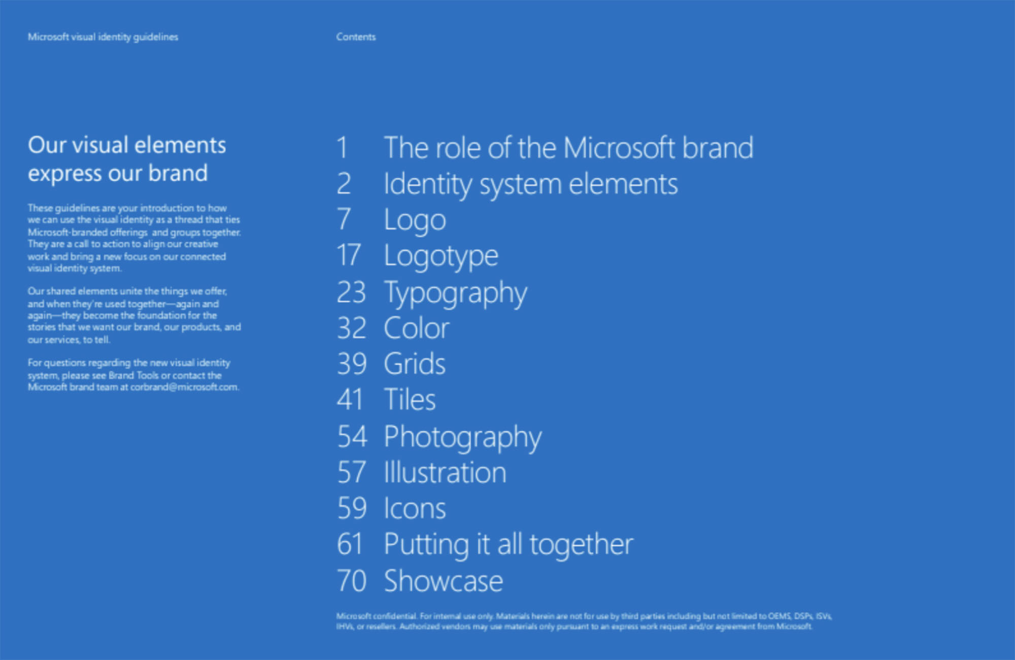
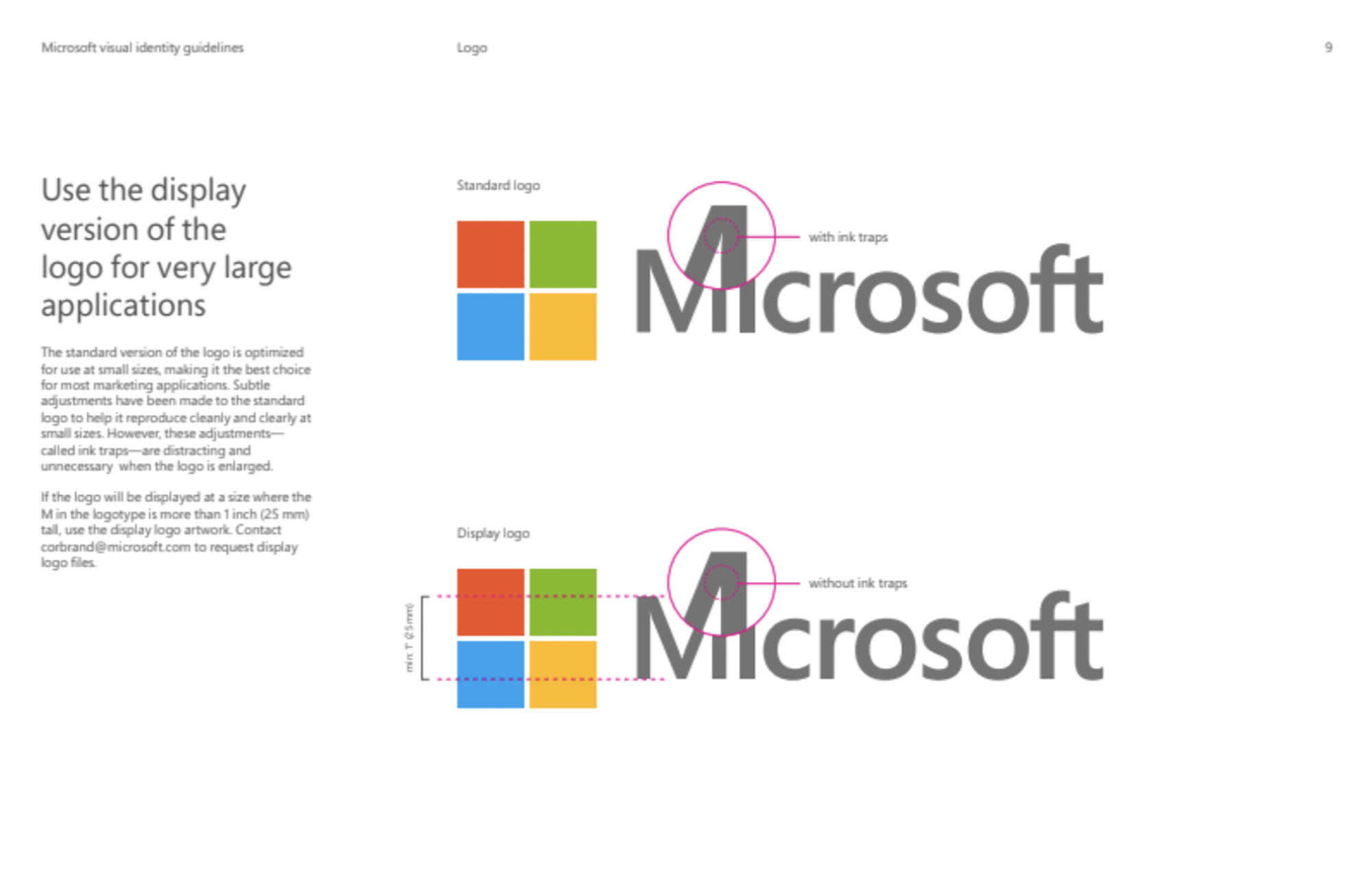
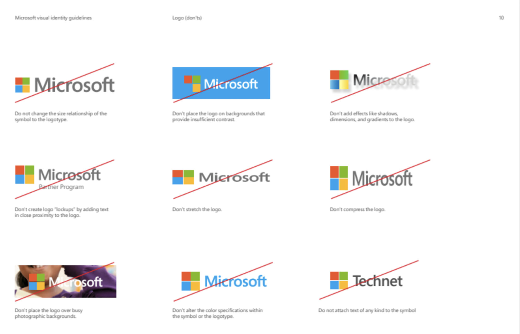
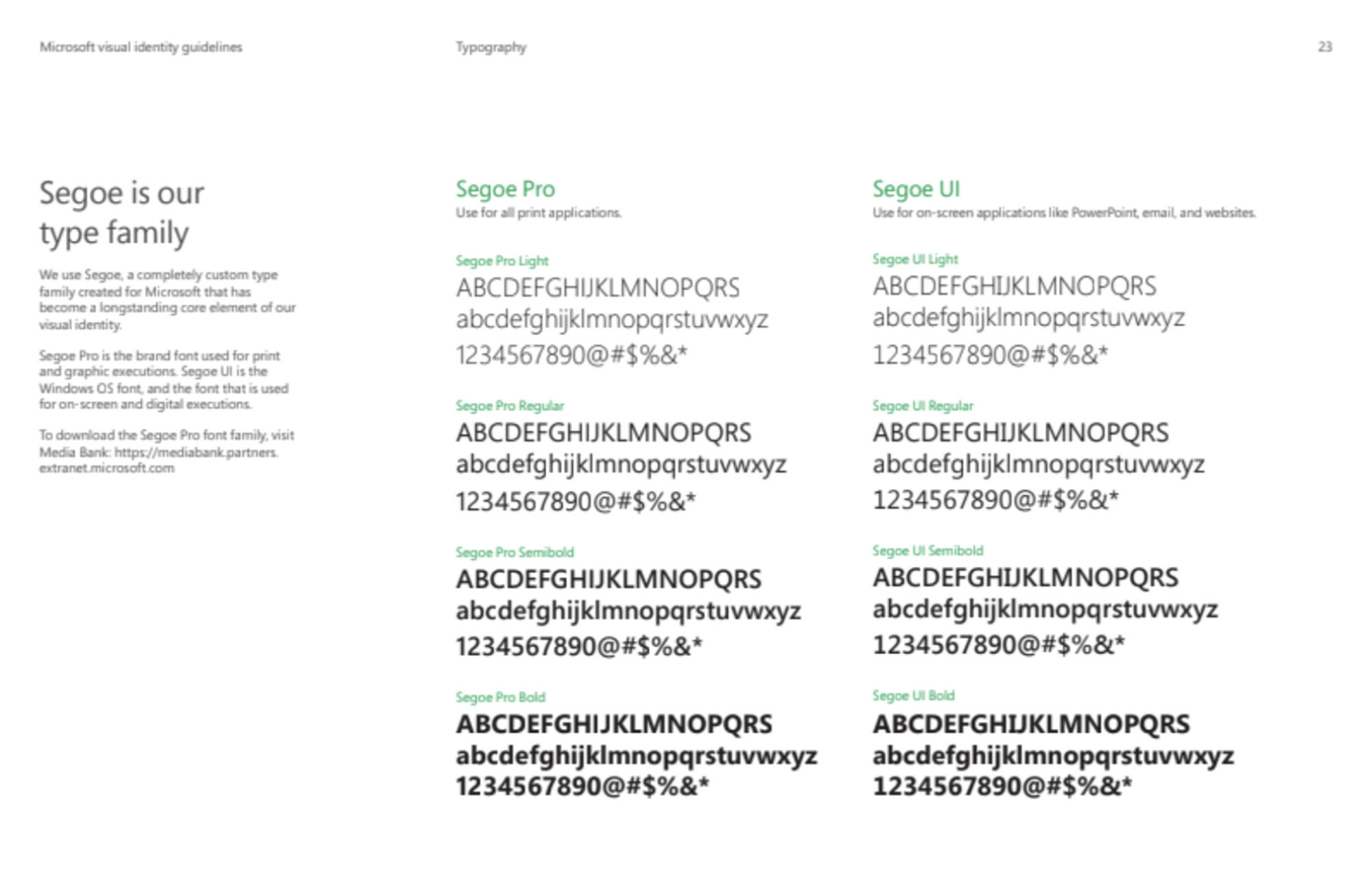
Microsoft Brandbook
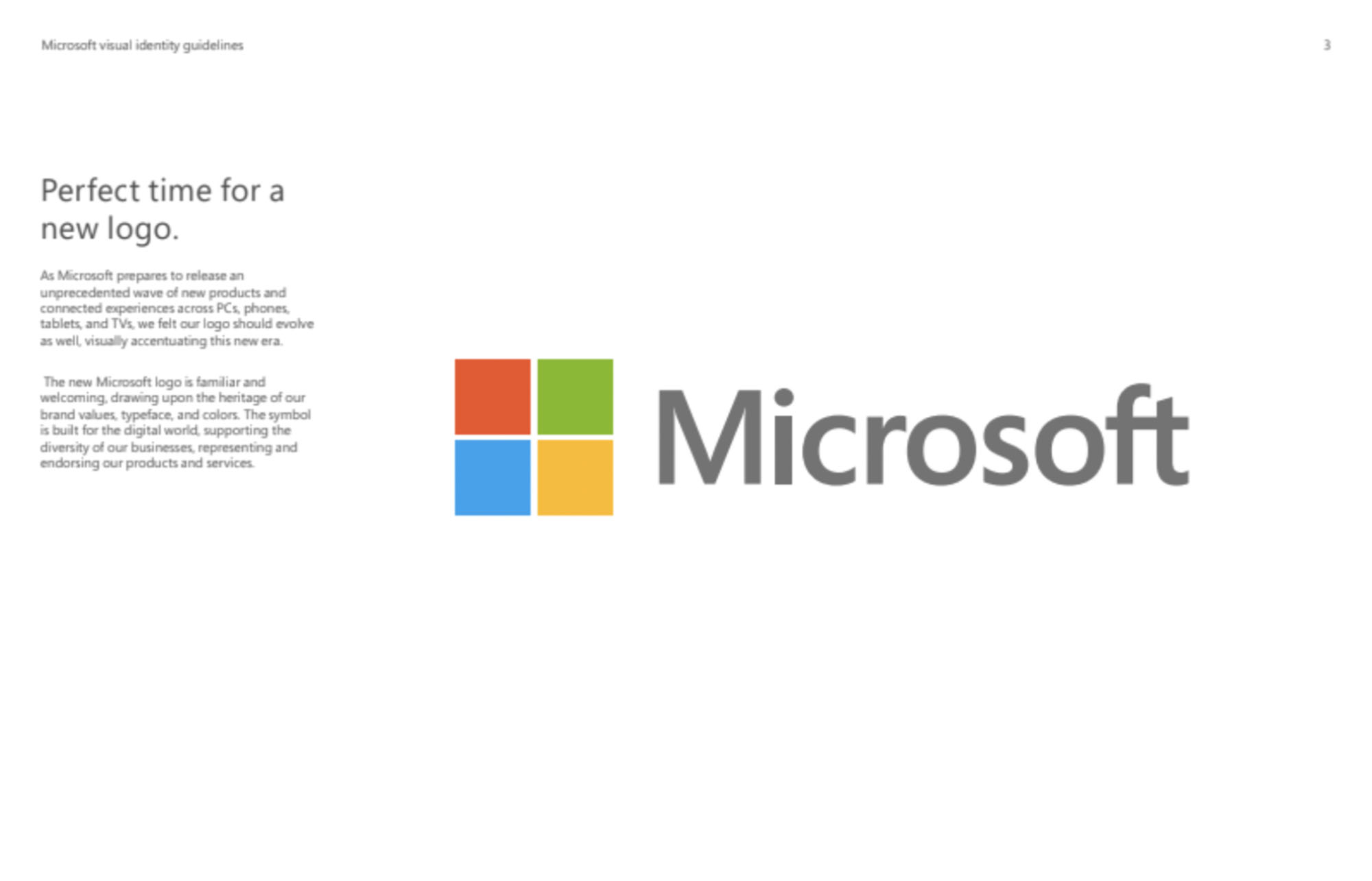
It’s been 25 years since Microsoft updated its logo. In 2012, the company unveiled a new version of its logo. The previous version had been around for a full 25 years. It was an incredibly exciting rebranding for Microsoft, as the new corporate identity touched all products across platforms, from Windows to Office versions, from phones to televisions. This wave of new releases was not only a reimagining of the company’s popular products, but was a new era for Microsoft.
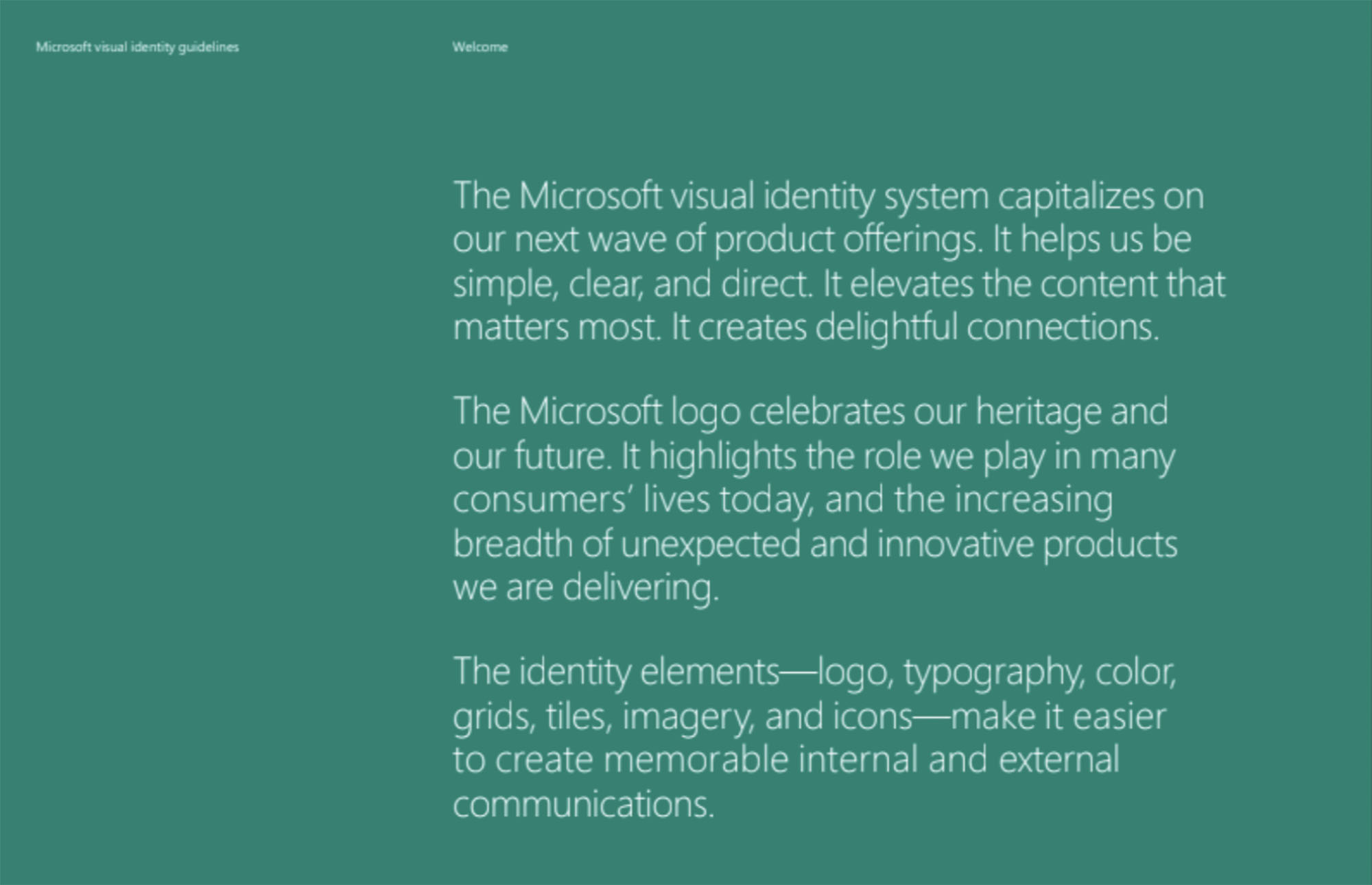
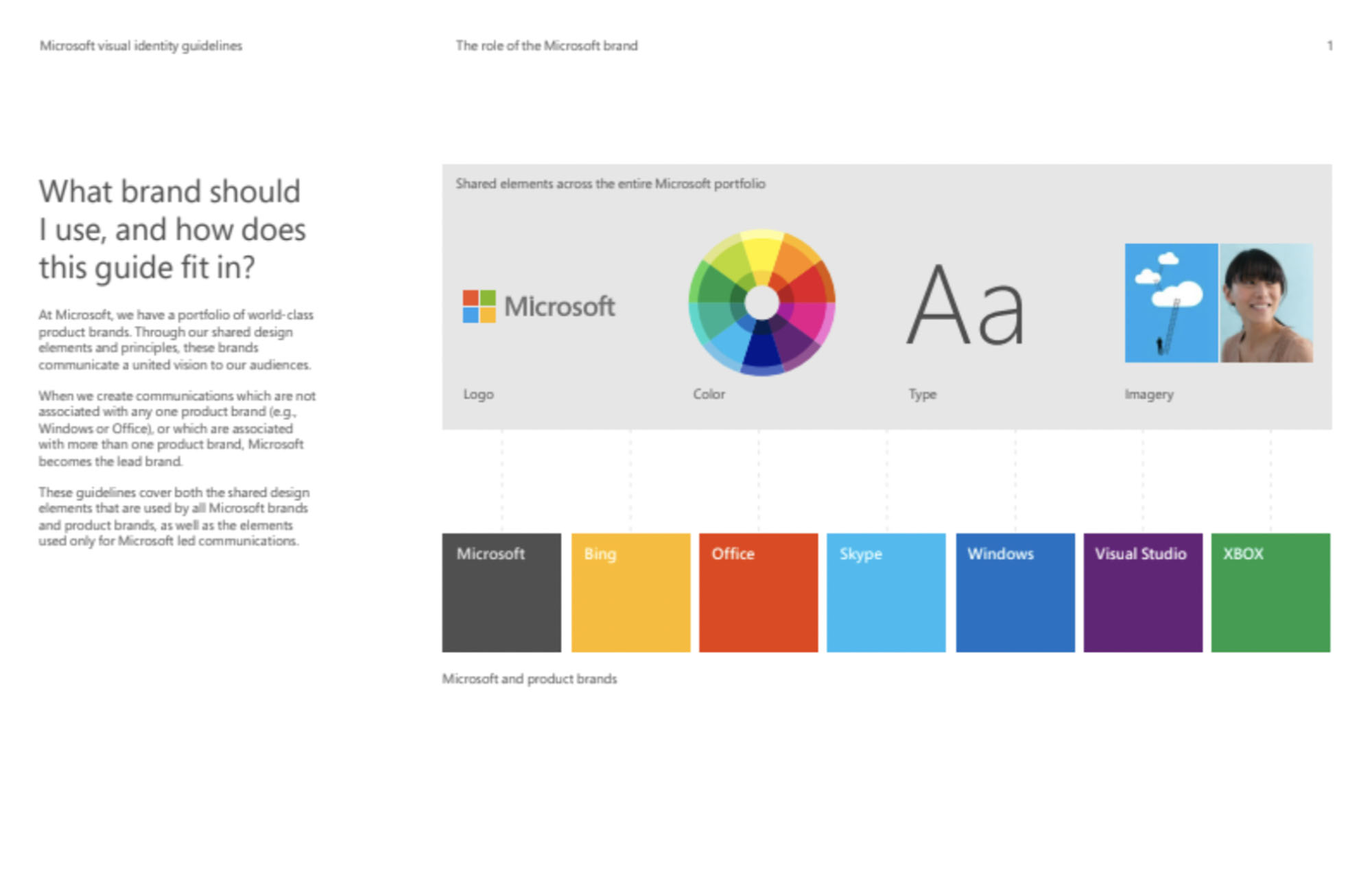
The 2012 guidelines provide a new vision for how corporate identity can be used as a unifying solution for the Microsoft brand. The new Microsoft brandbook is designed to align creative work and draw attention to the new corporate identity.
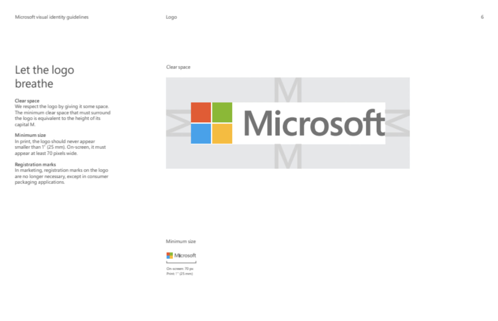
The task of the new logo was to show the evolution of the company and visually emphasise this beginning. The Microsoft brand is more than just logos or product names. More than a billion people use the company’s products every day. Every point of contact with the products is a “brand impression.” That’s why Microsoft’s new logo draws inspiration from the company’s product design principles, building on the brand’s heritage of values, fonts and colours. The brand book is built on the logo. It is a key element of the brand and corporate identity. The Microsoft logo preserves the heritage and gives birth to new connections across all Microsoft products.
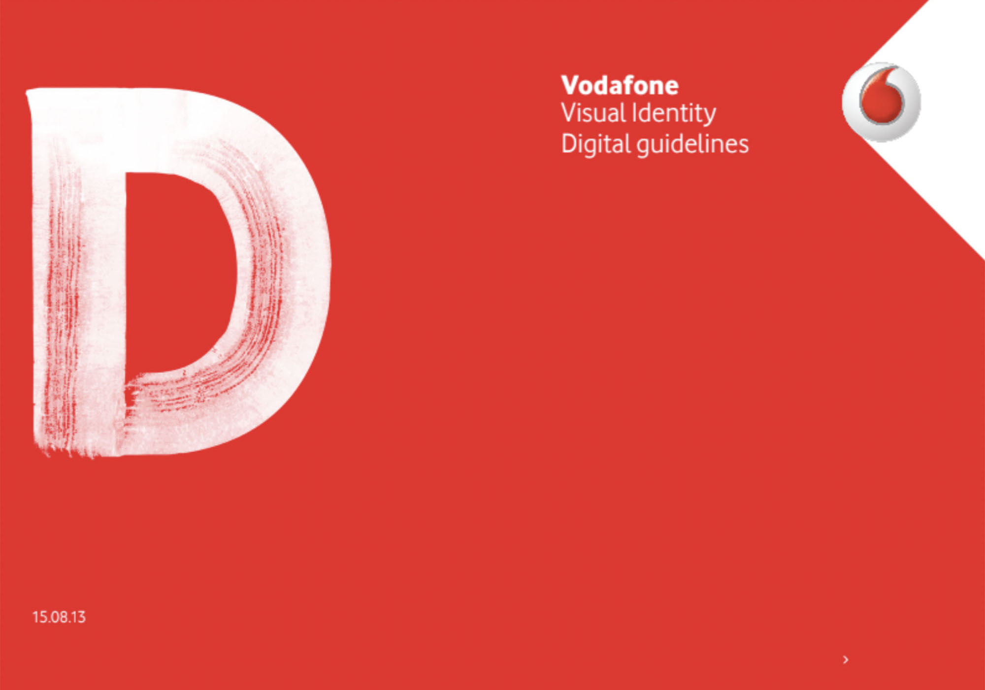
Vodafone Brandbook
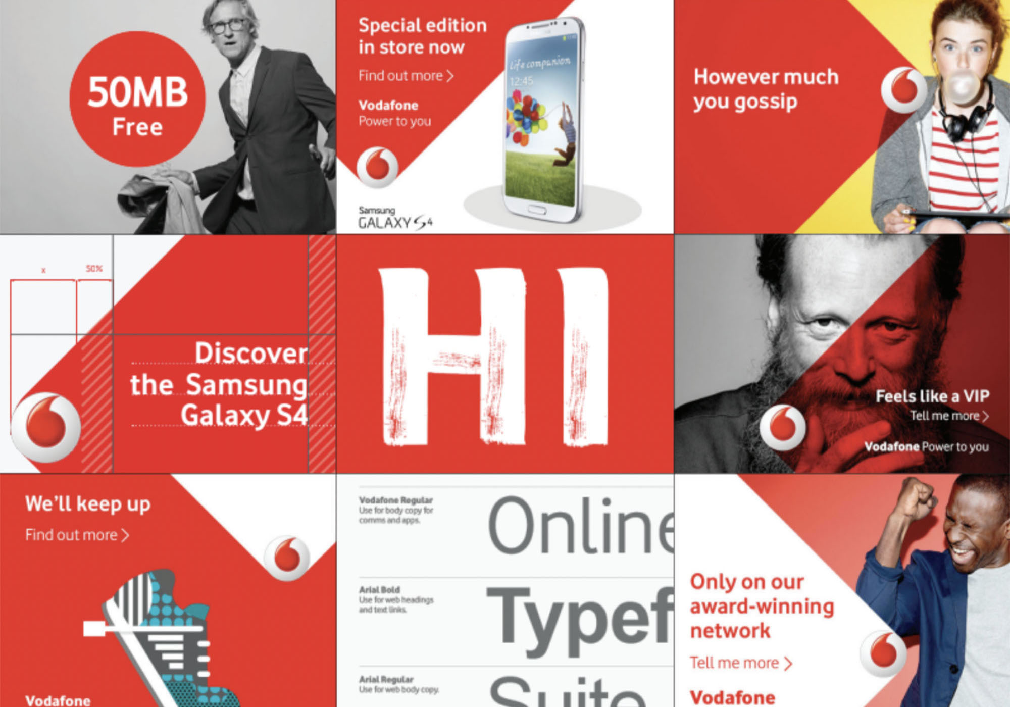
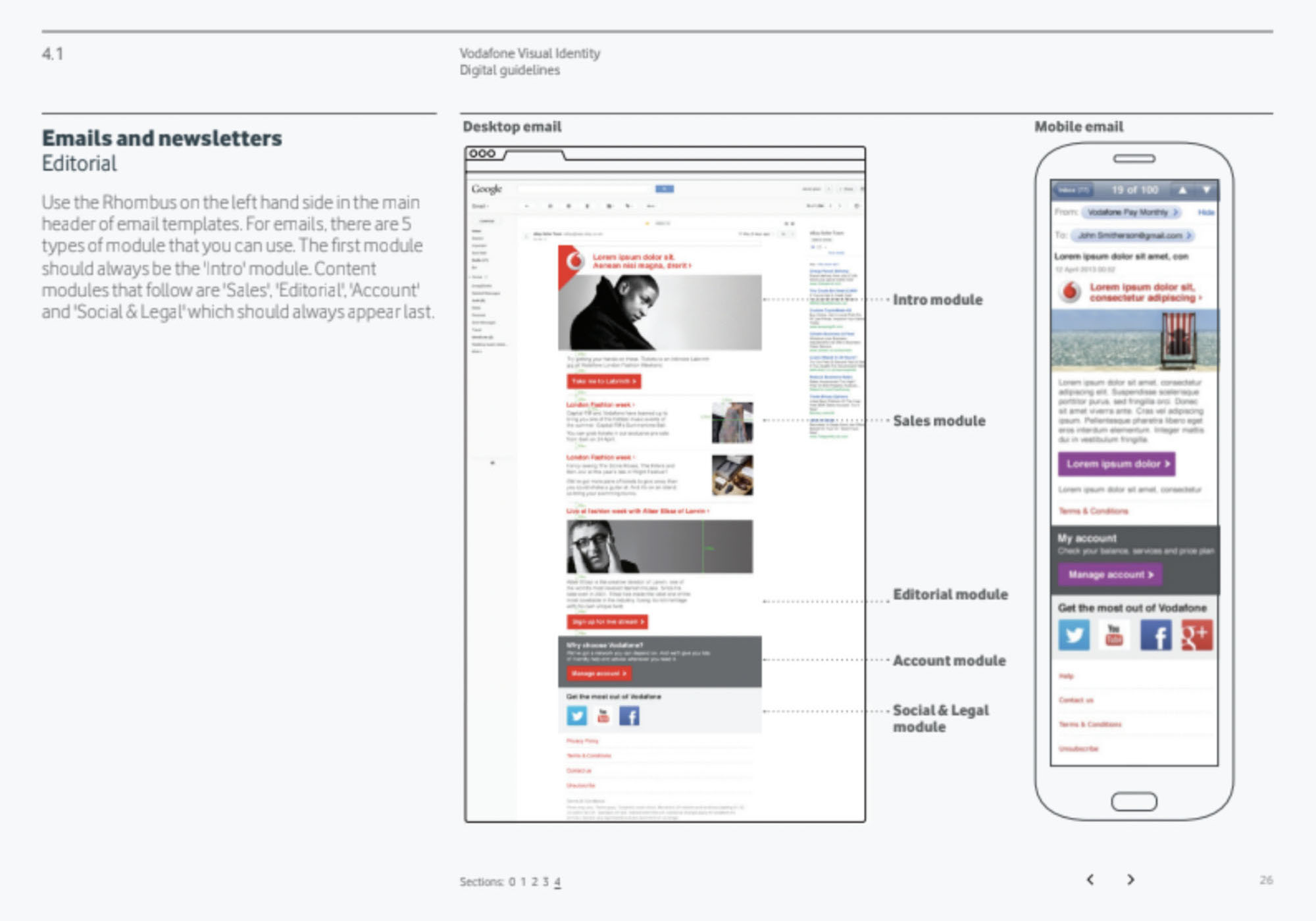
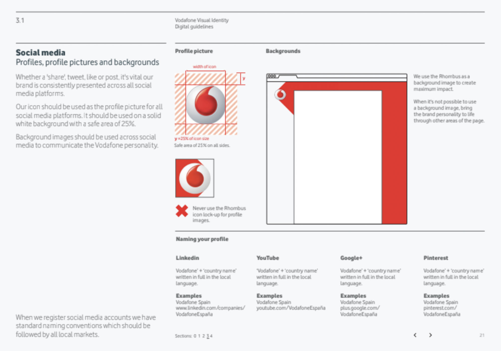
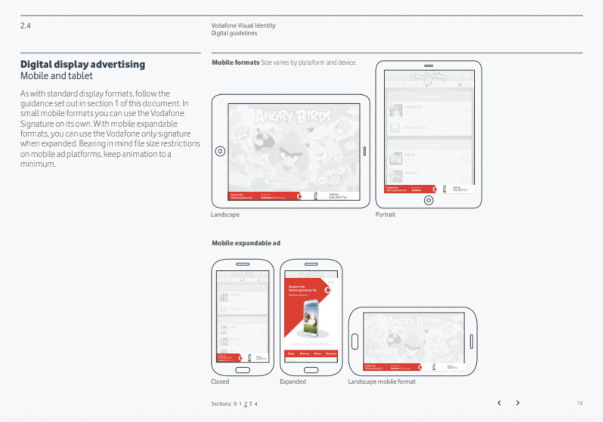
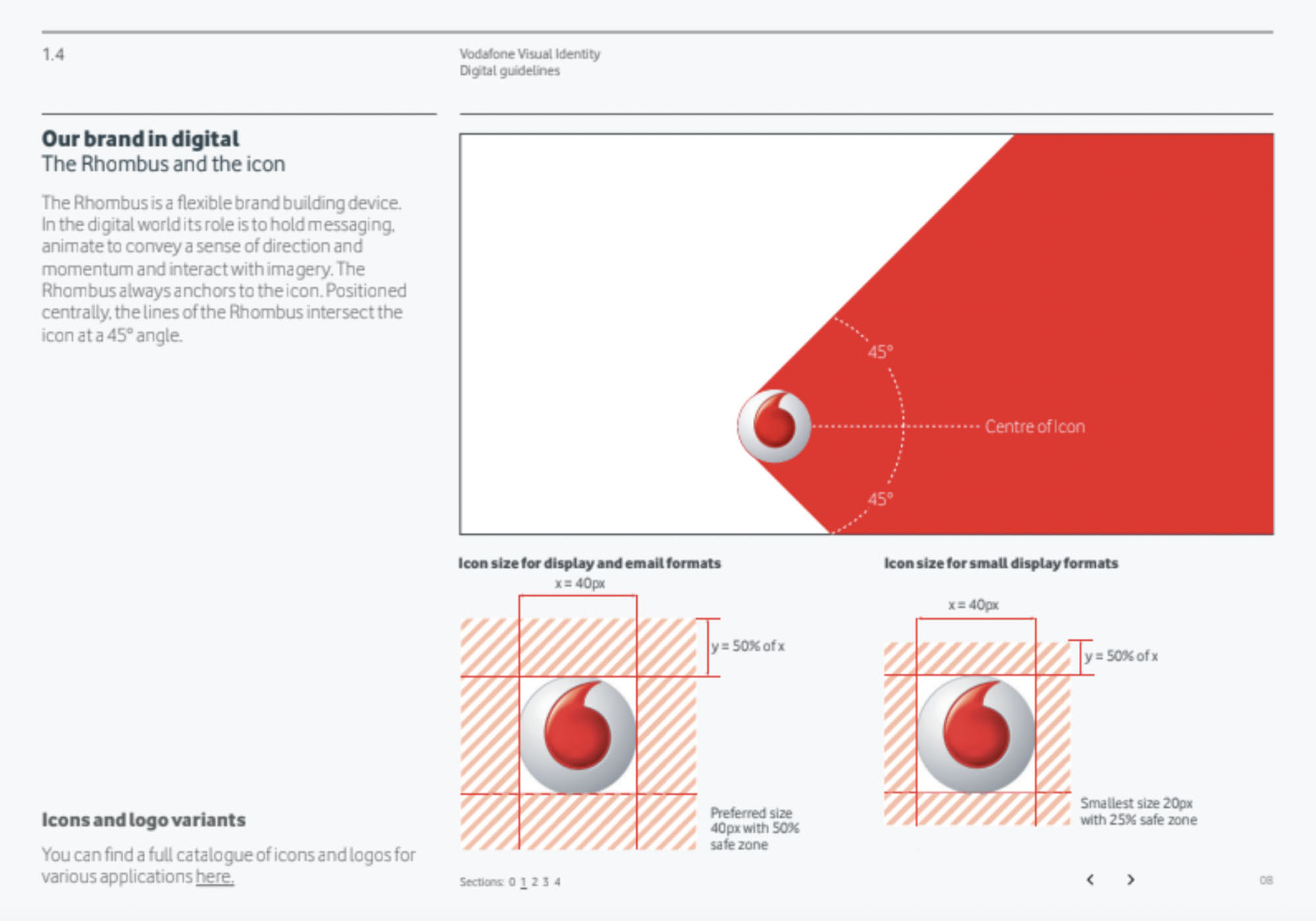
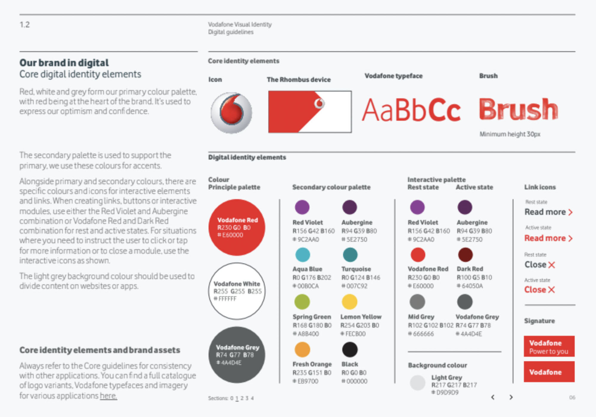
Vodafone is one of the most recognized and valuable telecommunications brands in the world with an estimated value of $22 billion. In our collection we have a version of the 2013 brandbook, which is now an outdated version of the company’s corporate identity.
The old corporate identity was born out of the rhombus, which was the basis for the main advertising communications. The rhombus, as Vodafone states, is a flexible figure to express the brand’s visual language. In the digital world, its role is to convey a sense of momentum and interaction with images. The rhombus is always associated with the logo. Located in the center, the lines of the rhombus intersect the logo at an angle of 45°.
In the new corporate identity (English – visual identity) pays much more attention to the symbol “speech mark” Vodafone. And this is the key difference between the old corporate identity and the new one. The “speech mark” logo was created in 1998 and became one of the most recognizable symbols of the company. In the new corporate identity, the “speech mark” is the central graphic symbol that is given a major role in marketing and visual communications. The logo in 2017 became simpler and received a “flat” design instead of a pseudo 3D solution.
© Trade marks mentioned are the property of their respective owners, all rights reserved.

